It’s no secret I’m no white walls / white trim girl. I’m all about bold design and colorful spaces. I’m a traditionalist, a grandmillenial, a modern Victorian. Berrybrier absolutely reflects this and I wanted to to share the whole house palette today so you can see how — even though my house may read as colorful — the limited color palette unifies each room to the others.

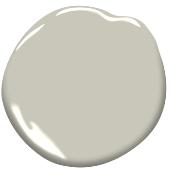
Do you see how tight this color palette actually is? Yes, my dining room (Benjamin Moore New London Burgundy) might be the color of a good pinot noir and contrast from the dark green trim (Benjamin Moore Forest Floor) in the rest of my house, but it’s tied to the same color family as the light pink in my master bathroom (Benjamin Moore Pink Beach). The green of the trimwork (Benjamin Moore Forest Floor) throughout the house, is only very subtly different from the wall color in my bedroom (Benjamin Moore Tate Olive).
Color Theory
So to understand how to put colors together to create a whole house color palette, it’s important to know a little bit about color theory. Lifehacker has a good article about this if you’re interested. I don’t want to dive too deep, because this is a whole post in itself! But I do want to touch on the basics. Colors all fall into the color wheel. Primary colors are colors that cannot be made by mixing two colors together (red, yellow, blue) and the colors on the wheel between primary tones are colors that are created by mixing different amounts of the primary colors they fall between. Colors that are opposite each other are complementary, which means they contrast, but also look good together.
One of the best examples of complementary colors is Christmas. Green and red are opposite each other on the color palette and both demand attention, but also play up each other.

The other thing to know about color theory is on the far right above. Shade, Tint, and Tone are ways to transform “pure” colors. Tint is to add white, shade is to add black, and tone is to add grey. This is where you want to pick your paint colors from. Anything too close to a pure color on the color wheel is going to scream at you if you put it up on your walls. Thus it’s important to made sure any paint colors you pull are heavily tinted, shaded, or toned.
Berrybrier Color Palette
Let’s take a closer look now at Berrybrier. Each of the colors in Berrybrier have been toned (added grey) down to make them less extreme. Colors like Pink Beach have been tinted (whitened) as well and colors like New London Burgundy have been shaded (blackened) to create more depth.
Now, one of the other reasons my bold whole house color palette works well is the mix of dark and light colors. Everyone knows black and white are a dynamic duo, right? If you want to mix bold colors, think of that for your house too. You want light colors besides dark to create that contrast which allows them both to shine.
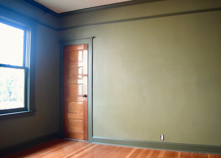
This is Benjamin Moore’s Brushed Aluminum next to Benjamin Moore’s Forest Floor. They’re highly contrasting, but they compliment each other since one is quiet, light and subtle; and the other is bold, dark, and dynamic.
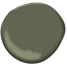
I wanted a subtle, clean wall color for the main spaces at Berrybrier that didn’t go too grey or too beige. I landed on Brushed Aluminum since it met in the middle. Forest Floor was my bold green choice I selected when renovating the main bathroom – I wanted something that would pop off the black and white floor! When I finally decided the green paint color should become my trim color throughout the house too, the colors worked really well together. Here’s how these two colors look in real life in my living room.
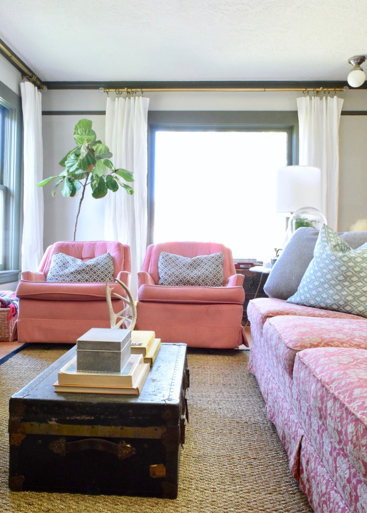
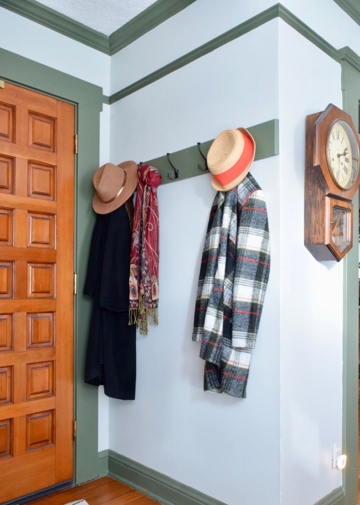
The same colors are in the entry (which is really just a corner of the living room) and the small space has a lot of trimwork. The bolder trim color highlights all the traditional trimwork in such an awesome way!
Now if we add in Benjamin Moore’s Black, the colors are thrown into higher contrast. The black grounds the colors more and adds depth.

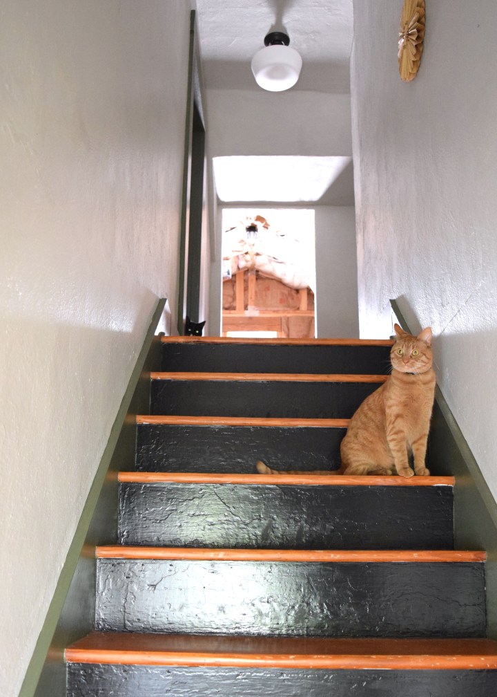
In my stairwell you can see how these three play off each other. The green of Benjamin Moore’s Forest Floor provides a really nice contrast against the orange tones of the original 100 year old fir floors throughout Berrybrier.
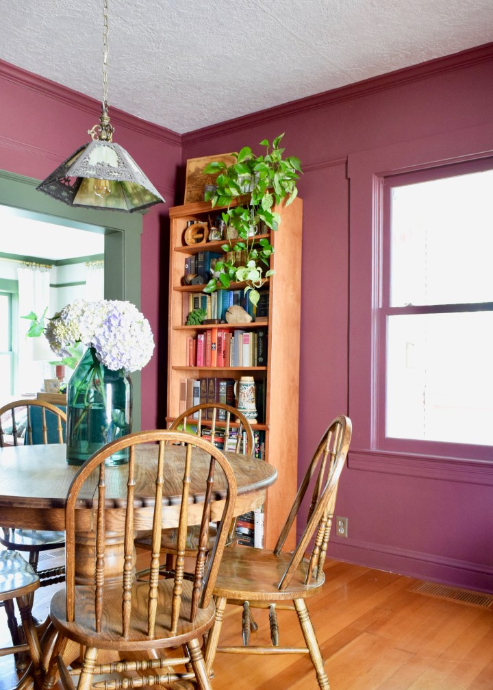
Let’s step back again and look at another color. I’m pretty in love with Benjamin Moore’s New London Burgundy! It’s such a deep and lovely red tone.

In my dining room, this color takes center stage on the walls and the trim!
There is some green in this room though! The green tones in the dining room are all accents. This works really well because red and green are complementary colors, remember? They’re across from each other on the color wheel. So even though the green of Forest Floor is much more subdued than “Christmas” green and the red of New London Burgundy is much deeper and almost more purple than “Christmas” red, the colors were selected to be friendly with each other.
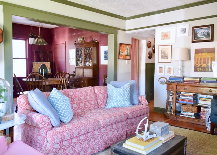
If we step out even further and you look at how this dining room connects to the rest of the house, you consider three colors once more: Brushed Aluminum, Forest Floor, and New London Burgundy. The lightness of Brushed Aluminum provides much needed relief from the deeper color of the other two.
Looking from the living room into the dining room, these colors all come together in one sight line. The living room feels lighter and brighter and the dining room feels moodier. If they were both painted darker hues, the two spaces would read totally differently.
And now, my bedroom, which I still haven’t finished! Here we focus again on a green tone: Benjamin Moore’s Tate Olive.

In my bedroom however, I didn’t do the trimwork the same color as the walls, but instead opted for a subtle contrast by using the same Forest Floor that was on the trim throughout the rest of the house. These colors are super similar which means they inherently go well with each other.
Here in my master bedroom you can see how this subtle contrast lends itself to the more elaborate trimwork of my older house.
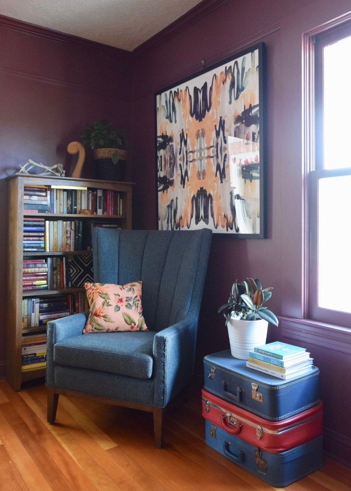
Through that door, we circle back to another complementary color: pink. As a variant shade of red, pink is a great complement to green and this color combo has been very popular lately.
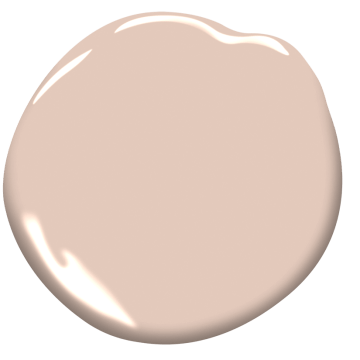
Benjamin Moore’s Pink Beach creates a bright and rosy room off of the darker and moodier master bedroom.
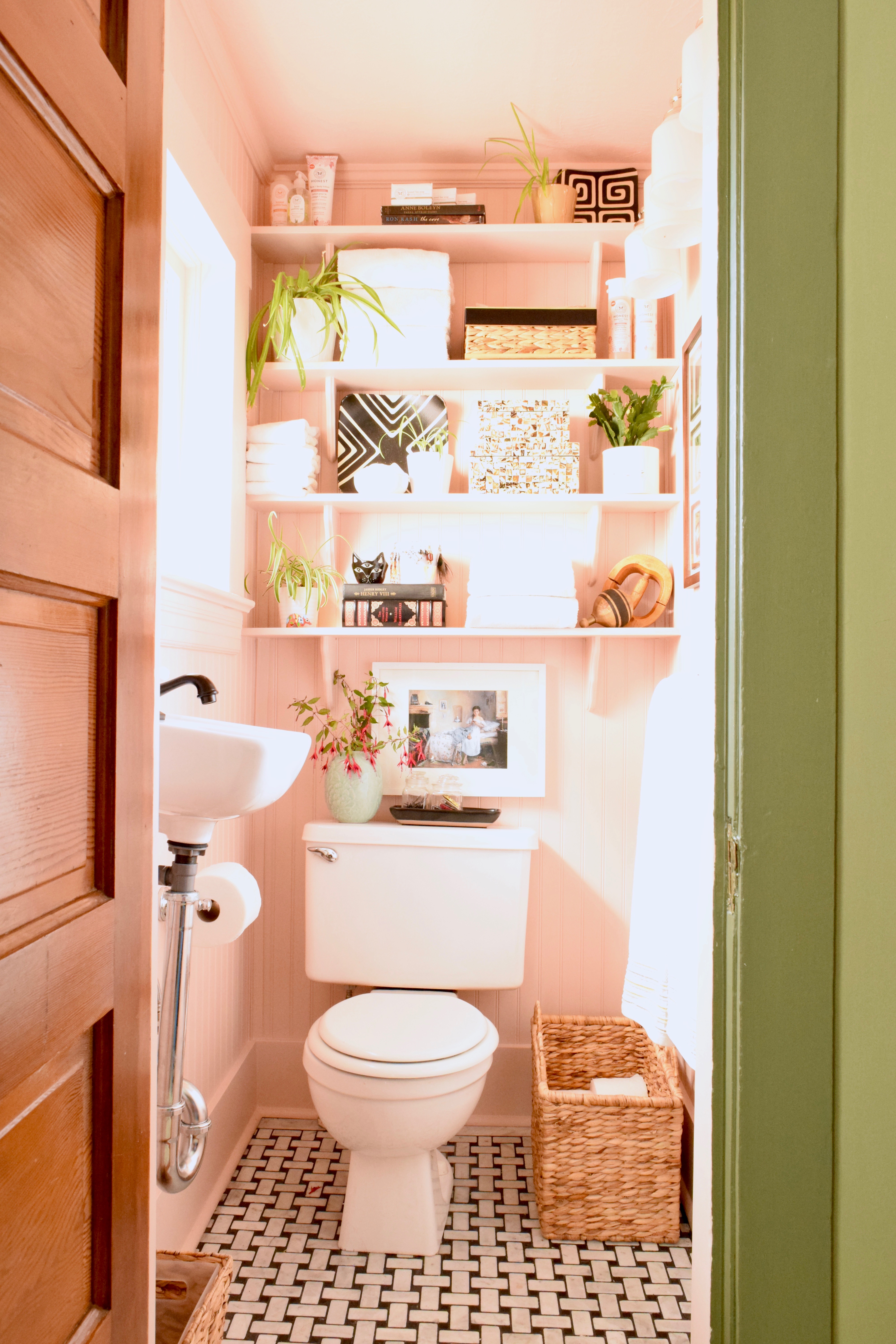
The color of the bathroom, Pink Beach is so light compared to the darker bedroom, but one of the reasons why it feels right in the overall house palette is because it ties into the dining room’s New London Burgundy. These paint colors might not be near each other at all, but they still speak to each other in the same color family.
So, I’m posting the overall color palette one more time, so you don’t have to scroll all the way up to see all the colors of Berrybrier again. See how all these paints are really just three colors in varying tones?
Although I’ve used six different paint colors, my house can be summed up into three hues: green, red, black. Simple, right?
How to Put Together Your Own Whole House Color Palette
Now if you look back at the color wheel at the top of this post, start to build your own whole house color palette. Think of how the different hues are going to play with each other and make sure you’re collecting complementary hues and mixing in light and dark contrast. Here are some guidelines!
- Select complementary hues as accent colors for your home.
- Think about how you want the room to feel. High contrast and bold? Or subtle and clean? Choose colors accordingly.
- Pay attention to sight lines in your home, will the color of that room look good when you’re seeing it with the colors of the room next to it?
- Scale the number of paint colors to your home. 6-9 paint colors works well for a smaller 1,400 square foot home with 3 bedrooms; any more could feel disjointed and jarring. In a larger 3,000 square foot home you could potentially have more paint colors since there are more rooms.
- Layout your color palette before painting! If you’re painting one room at a time, save your paint swatches in a binder to compare to potential new colors. Make sure things are reading well as a whole palette and it doesn’t look like someone threw the paint store swatch aisle into your home.
- Always, always stay away from super bright “pure” color for paint, make sure your swatch looks grey’ed down and tonal. I promise it will look much bolder on the wall.
- Remember, there’s always a good design that breaks all these rules, but it’s hard to achieve unless you’re trained to know what you’re doing!
Whew, that was a lot of info. I’m exhausted now. Ha! I hope this helps when you’re putting together paint colors for your own home. Let me know if you have any tips and tricks for devising your own house color palettes in the comments!

You should put together a few examples of other whole house palettes! (Specially in the red white and blue family😉).
Girl what do you know that’s in the works!
Hi Laurel,
How refreshing you are in the internet sea of designer blogs featuring minimalist cold grays, same old off whites, and, my personal favorite, I must admit, warm mid-tone neutrals. My favorite ice cream flavor is vanilla, so that tells anyone all they’d need to know about me.
My sunroom color is currently a deep green; my other paint-loves besides the mid-tone neutrals are soft grayed down greens. I’m researching paint shades to take it from it’s current Benjamin Moore Creekside Green to a richer, yet still soft, shade. That brought me to Forest Floor, and you.
Your colorful vision is bold and fun! Green with red/rose/pink/blush is basically as fresh as flowers in springtime, and you have pulled it off perfectly! Thanks for your help in my Forest Floor research.
Sending compliments to you for your beautiful and lively results!
Hi Virginia. Thanks for following along. Im blushing! I’m definitely a lover of bold color and Forest Floor is one of my favorites! Good luck with your sunroom!
I really like what you’ve done with your bold colors – even though I personally couldn’t live with the green! Is there a specific reason for not painting the dining room picture rail and window trim with Forest Floor? My personal vision for that room would be burgundy walls, green trim and black bookcases, table & chairs with a big floral on the windows (maybe Roman blinds rather than something fussy).
We recently moved and are currently ignoring the previous owner’s medium golds and greens – but the house often feels like a cave. I’m planning for the day when we paint everything with tints – pale pink and pale peach in most of the house and pale buttery gold in the basement. Our house has deep porches and small windows so we’re hoping to lighten things up!
I just found you from Chris Loves Julia’s Homebody Awards and spent the past week reading from the beginning – such an adventure! Keep up the good work.
Hi Cheryl! Thanks for reading! I wanted the dining room to really feel like a cozy space and didn’t want to break up the merlot color with lots of green lines that might feel choppy. I love your vision of the black bookcases and Roman shades though! That’s exactly what I’m thinking too.
Your space sounds lovely! Lighter colors could definitely help, but don’t forget that leaning into the darkness often helps if it’s not getting much natural light! -xo, LO
I like to think of window trim as eyeliner so maybe consider just that trim in green – especially if you find a large floral with a lot of green for the windows.
Having lived with medium paint colors for a year we’ve decided that going almost white will suit us better. The person mixing paint colors always asks if I realize something will be almost white when I ask for a rather light color to be mixed at 25%. Swatches have been extremely helpful to learn how colorful those almost white colors look in our house – not as colorful as your house but definitely not white!
I’m all up to date with reading your blog now – can’t wait for your next adventure!
Ha totally! I agree. Window trim is the eye liner! I love how it pops in my living room and draws my eyes outside!
I really appreciate you for publishing this blog here about whole house color palette berrybrier; it’s really a helpful and very useful for us. This is really appreciated that you have presented this data over here, I love all the information shared. Great article!
Thank you! It is a great concept for people looking to paint to consider how the rooms will interact!
Good reading youur post