I thought I’d continue today on the theme of paint! If you’ve been reading along I’ve already covered the Berrybrier whole house paint color palette and how to pick paint colors. I’ve got something juicy today: a round up of 5 paint color palettes that will work in nearly every home! Picking paint can be daunting, so I’m taking the guess work out of it for you. I headed to my local Benjamin Moore paint store (Dick’s Color Center for you Portland locals) and pulled some fun color palettes that will work for anyone. I’ve included some descriptions of where I can envision each color palette, but these are just jumping off points, each palette would work in any style home! And, if you want to dive into diagnosing your own personal design style, check out this post here!
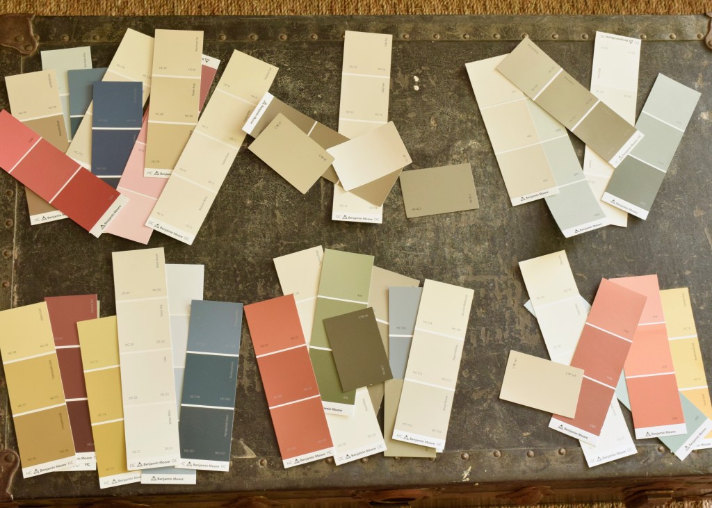
Again, don’t take these pictures too literally, these palettes would work in a home of any style, but I wanted to give you a visual idea of how these colors could work with design styles too. I’ve also played around with how each of these paints could define different rooms, again, this is all open to interpretation, but it’s fun to go on a little imaginary house tour right? Let’s begin!
Americana Paint Palette

First, I wanted to dive into a true Americana palette of red, white, and blue. This can be a tricky color palette and when done wrong, it can look like Fourth of July threw up in your house! But don’t worry! I’m here to make sure that doesn’t happen. These colors will allude to our primary hues, but keep things sophisticated and mature.

Hearth Red | Alexandria Beige | Hale Navy
Manchester Tan | Amaryllis
For this Americana palette I see a lot of muted tones in the main spaces so bold patterned fabrics can pop. Edgecomb Gray is the main living room and hallways color with Seapearl as the trim paint. The kitchen has tonal paints with Edgecomb Gray on the walls but a contrasting Bleeker Beige on the cabinetry. A dining room goes dynamic in Hearth Red. Alexandria Beige puts on a moody vibe in the study and Hale Navy creates an impactful entry. The Master Bedroom is light in Manchester Tan and a guest room brings in Bleeker Beige again. A delightful pink powder room in Amaryllis is a nod to the deeper toned dining room.
Spanish Style Paint Palette
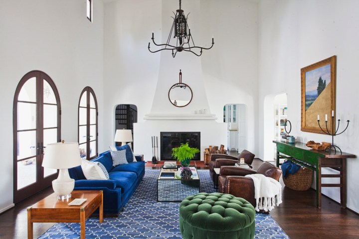
Spanish style homes are famous for having plaster arched doorways which means there are often fewer cased openings to start and stop paint colors. This is why many Spanish Style homes have clean white walls and a riot of colors in their furniture pieces!
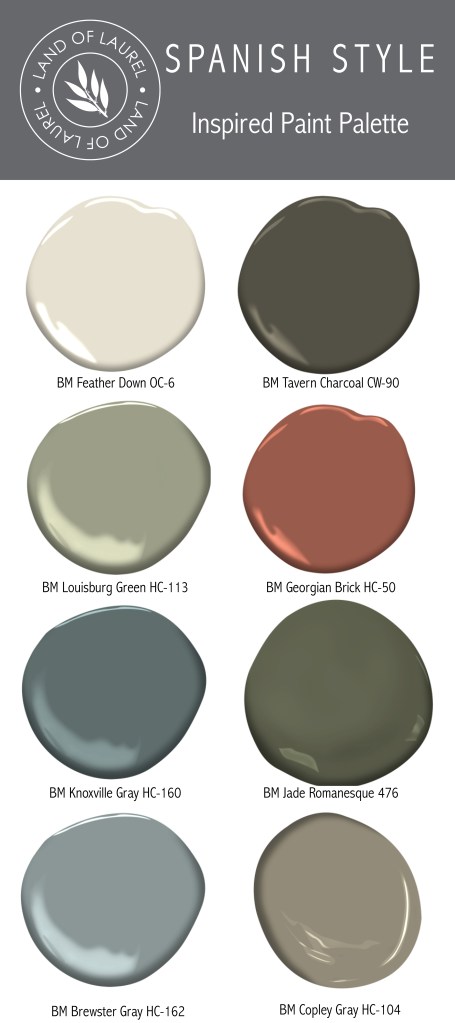
Georgian Brick | Knoxville Gray | Jade Romanesque
Brewster Gray | Copley Gray
Spanish style homes are the types of home that can take a good dose of color in the secondary spaces which is what I had planned for this palette. The main paint would wrap through the majority of the house and be the light and bright white Feather Down and would contrast from the dark Tavern Charcoal trim paint. The master bedroom would get a splash of Louisburg Green paint which would create a great backdrop for bold reds in textiles like bedding. A master bathroom vanity or living room architectural element would be highlighted in Georgian Brick. Kitchen Cabinets would be painted Brewster Gray, a sophisticated blue tone that looks great with copper and iron. A powder bathroom or even pantry near the kitchen would be a step darker in Knoxville Gray. Guest rooms would round out the palette with Jade Romanesque in a darker north facing room and Copley Grey in a more subtle, brightly lit space.
Modern Minimalist Paint Palette
This palette is cool, crisp, and clean. It’s very neutral, with minimal color. It feels modern and classic. Saturated hues in secondary spaces punch up the palette and generate excitement.

Wind’s Breath | Carter Gray
By nature, the modern minimalist paint palette is — well — minimalist! The few colors repeat throughout the house for a cohesive and calm feel. The popular warm grey tone Revere Pewter graces the main spaces with a crisp white trim color: Steam. A bathroom is painted Finnie Gray for a subtle contrast. The master bedroom goes bright and light in Wind’s Breath, while a guest room goes deep in Carter Gray.
Bold Traditional Color Palette
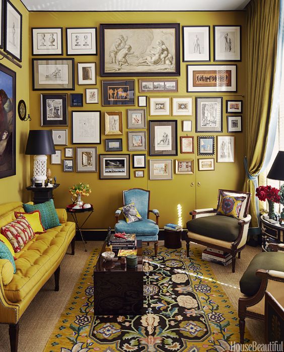
This color palette is a riot of color and fun. It pairs well with funky, colorful wallpapers and a sense of humor. I can see this in the home of a traditionalist who likes to have some excitement in their lives. It’s a palette that needs a house with lots of trimwork and all cased openings to allow transitions of colors between rooms. This color palette is not for the faint of heart, but boy do I love it!
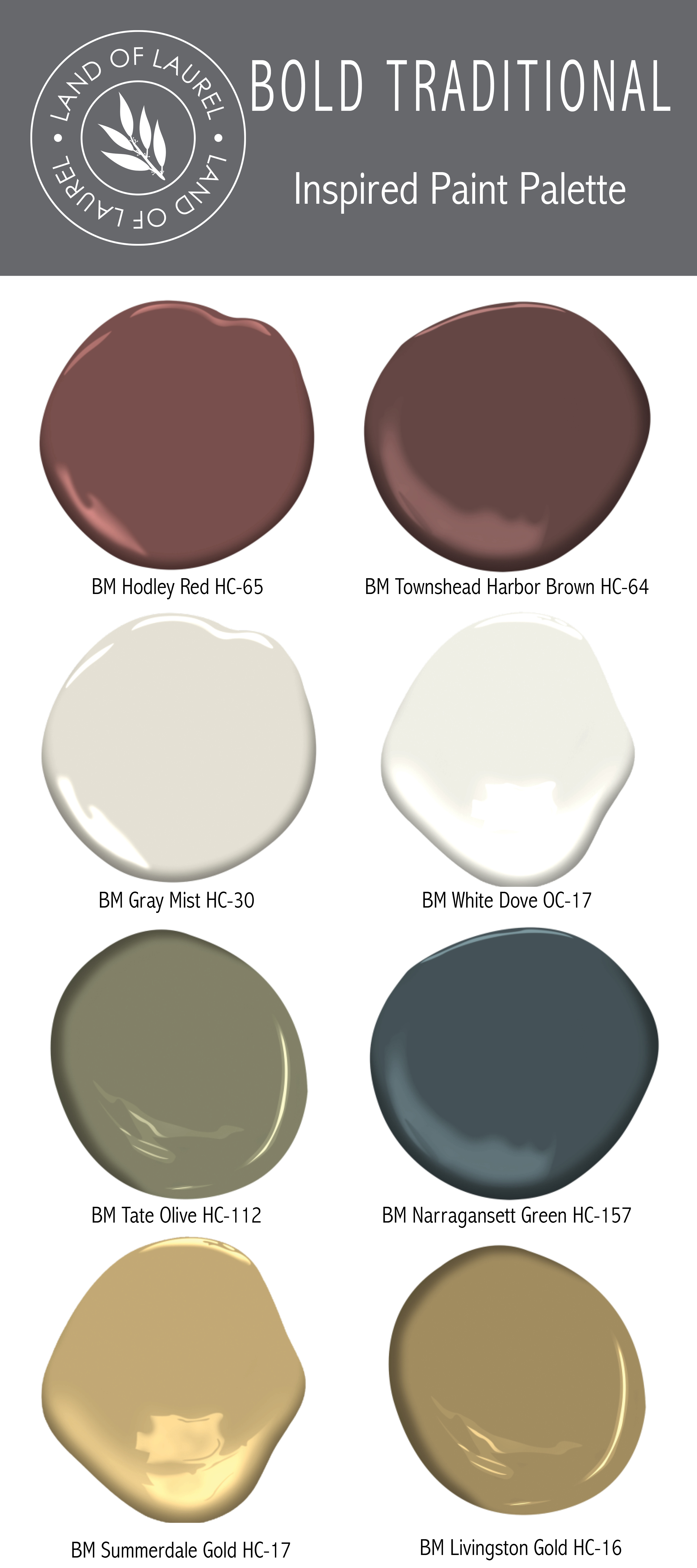
White Dove | Tate Olive | Narragansett Green
Summerdale Gold | Livingston Gold
The shadowy and smaller entry of this stately home is painted Hodley Red with the barely contrasting Townsend Harbor Brown trim, moody oil portraits line the walls. The sunroom is light and bright in Grey Mist with White Dove trim and leads into the kitchen where the paints stay the same and cabinets in Tate Olive provide a dramatic flair. The dining room is stately in the blue green Narragansett Green color with crisp White Dove trim. The sunny formal living room is Summerdale Gold with Livingston Gold trim and filled with a mix of dark and light furniture.
Cottage Paint Palette
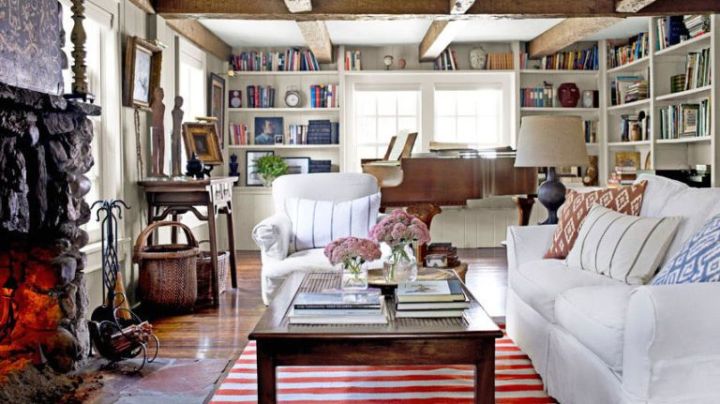
This color palette I can image in a cute cottage home, like the darling house Kate Winslet’s character resides at in the movie the Holiday. It’s a cozy palette, with an old world feel that just makes you want to curl up by the fireplace with a good book and a blanket.
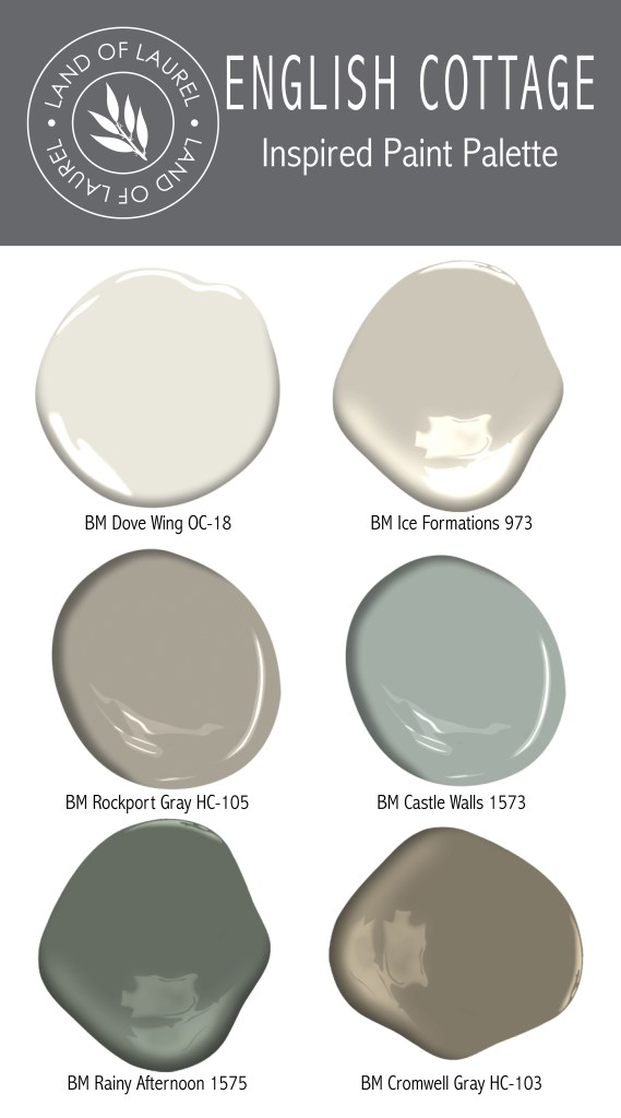
This is the perfect palette for a smaller home, I really picture the cutest little English cottage style home with lots of architectural wall treatments. White Dove is the main color and sweeps through the living room and hallways with a darker trim in Ice Formations. Rockport Gray becomes the kitchen cabinets to create a cozy little space next to the main wall and trim color. A powder room gets a punch with trim and wainscotting in Castle Walls and Dove Wing above the paneling. A small mudroom or entry is full of built-ins and floor to ceiling V-groove wall paneling, Rainy Afternoon coats these architectural elements, the trim, and the ceiling creating a moody little space perfect for removing rain boots. Cromwell Gray is the master bedroom paint creating another cozy, dark space perfect for winter hibernation.
Mid-Century Modern
This color palette is a fan of modern brown tones (and brown is in again, my friends!) that pair well with fun accent colors. It’s a great palette for modernizing your new mid-century home or for adding some fun to another style space! This color palette doesn’t take itself too seriously.

For this, I’d paint the main spaces of the house in Alaskan Skies with Glacier White as the trim color throughout the home. I’d paint an old brick fireplace the vibrant Grenada Villa to liven it up. Kitchen cabinets in Stuart Gold make a bold and sunny statement. The master bedroom goes calm and sultry in Stampede while a guest room gets a happy shade of Pumpkin Patch on the walls. A powder bathroom or a separate dining room gets a jolt of color in Burnt Sienna to round out the palette.
Are you painting your home soon? Which color palette is your favorite? Is there anything else you’d like to know about paint colors? Let me know in the comments below! I’m enjoying writing this paint series!

Thanks 😜
I just discovered your blog and I LOVE it!! I LOVE your whole paint pallet ideas, and that it’s not typical like everyone else’s colors. I have tried & tried for house paint colors and can’t seem to figure it out. We bought a remodeled mid century modern home. Our wood floors are that late 1990’s – 2000’s red floors. A warm cherry color. What whole house color?? I understand color, tones, etc.; but for some reason I cannot figure this one out.
Aww thank you! I’m so glad you’re enjoying it! If your floors are a red orange color definitely go with a palette of cool paint tones. Avoid any neutrals with a green undertone. The English Cottage palette might be a good place to start!
How do you pick paint for a North facing home with that red orange looking floors, no natural light and no open floor plan? I love earth tones and I bought White Dove for all over trim. Evergreen fog for my very small master bath. I was going with Edgecomb Grey for the walls but it looks really boring and Asylum like. It’s been almost 3 years and I’ve done absolutely nothing.
I am painting with Manchester tan by need a color for an adjacent room that goes with Manchester tan. The room in question has wine colored chairs and black and beige couch with a red antique chest. I don’t know what would go but not look to light or dark. Thanks for any help!
What about Alexander beige? That would work with your scheme and create a cozy feel
This is an explosive idea; this is most probably the best and most successful thing about 6 no fail whole house paint color palettes. I love this blog and really happy to come across this exceptionally well written content. Thanks for sharing!!When you look for same type of great content, like here then check out this Asp.net.nz also.
Laurel, do you think Alaskan Skies can be substituted for Ice Formations in the English Cottage palette? Alaskan Skies has a higher light reflectance value. And if so, switch to Glacier White for trim or stick with Dove Wing?
Absolutely. I do think keeping glacier white as it’s companion is a good idea. I still highly recommend swatching them on the wall to confirm!
Im in a quandry. My sofa is Manchester Tan color and the leather accent chairs are a tad darker than Alexander Beige. I would love suggestions on paint color for livingroom walls with an east facing windows. Thank you.
Hi . Open space southern exposure condo. Lots of light. Concrete gray floor. Looking for a paint color to warm up the space. Due to the floors, and grayish neutral sofa, feels very gray to me. Thanks for your recommendations!
Good luck! Sounds like a beautiful space!
Love this whole colour palette post. So refreshing with some new colours. How would you compare Alaskan Skies to Revere Pewter. Trying for a living room colour and the sample of Revere Pewter over my brown tweed couch which could have pink in it brings out a green undertone. Would Alaskan Skies be better. Is Alaskan Skies the same as Edgecomb as I see pink in Edgecomb. Thank you.
They’re each going to look so different depending on the other colors you have in the space and lighting. Alaskan Skies is going to be a bit lighter and more neutral though. Definitely put a swatch on the wall before committing! If you have a pink undertone in the sofa a pink undertone in the wall color will look neutral.
I’m moving to a bigger apt. My current one has dark colors which I love hot springs stone in living room and bleeder beige in bedrooms with dark shiny floors. I love how cozy it feels. Everyone though says too dark. The new place has natural not shiny oak floors and I worry since larger space and everyone thinks I pick too dark I should go lighter. Any suggestions ? Someone said winds breath ? I don’t like anything too yellow and do want a bit darker
In rooms with natural light you can definitely choose lighter colors, but don’t be afraid to mix in some dark ones too if that’s your preference! A dark cozy bedroom for instance sounds amazing. A lot of the lighter colors in this post would work well in a room that gets a lot of natural light
Question about pairing colors in kitchen. Walls are Manchester Tan, woodwork and cabinets are Greenbrier Beige. Want to paint the cupboards around the stove (presently a custom dark red). Counter is soapstone, appliances are black and floor is terra cotta. Kitchen is open to living and dining room painted with Salisbury Sage on top and Louisburg Green on the bottom. Would Louisburg Green work with the Greenbrier Beige?
I’m not sure! It’s worth putting a swatch up on the wall to check!
Which whole house palette would you suggest for house with honeyed wood trim/floors!
Reply, I’d probably avoid Modern Minimalist, but all the others would work well with honey floors!
Good morning I love your pallets. I was thinking about painting the outside of my mid-century 60s home in Florida pink but can’t find the right shade. I wanted something that was muted not too bright. I love the natural tones though two greens golds yellows so do you have any recommendations I’m not set on paint for the exterior. What would you recommend
Thank you linda
Hi Linda, how fun! I think nothing is more exciting than a pink house. I painted mine Sherwin Williams Mellow Coral. I also really love Benjamin Moore Pink Beach as a more subtle pink!
I’ve also just discovered your blog Laurel, and love it so much! You are a woman after my own colour heart :).
Quick question, I have a new in 2017 kitchen with cabinets painted in Ben Moore Baffin Island. Sadly I damaged some of the lower doors, they were fixed and resprayed by the company we bought kitchen from. It doesn’t match, I don’t believe it ever will. I’ve decided to repaint my lower cabinet doors, in a deeper dark greige that tones in with Baffin Island.
The colour I am leaning towards is Cromwell Gray by Benjamin Moore. I feel like I’m seeing enough mossy tones in it to work with the green tones in Baffin Island. The rest of the great room kitchen is in is warm tones, painted ivory white, with a hand scraped natural oak colour floor. Also a big old burgundy leather couch in the sitting area. I have warm greys in chairs, checked curtain panels etc. You inspired me to put my many seasons ago IKEA accent pillows in tones of pink, burgundy, soft green and grey embroidery on white background, on that couch and it looks amazing!
In this setting, what do you feel about Cromwell Gray with the Baffin Island? I want the colour to tone in and not stand out too much. Thanks a ton!!
Awww Beth thank you so much! And I’m loving this visual picture you just painted for me. It sounds really beautiful with the two tone cabinets and the depths of moody colors you have going on elsewhere. I say go for it!
Thanks so much for getting back to me Laurel! Love your old soul approach to decorating. I look forward to following your blogs and learning from you :).
Are you able to pinpoint the actual wall color in the Americana photo? I am planning to replace the current SW Urban putty in the majority of our living spaces with something a little lighter and less dingy. We are on the north Or. coast……lots of cloud cover and rain in our world. I am also working with a fair bit of natural wood in floors and wainscoting (honey shade). I think the color in the photo is just what I am looking for!