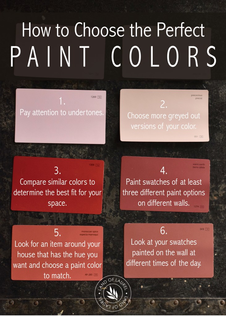
Even if you don’t own your home, at some point in your life, you’re gonna want to paint something. Whether it’s a wall or a chair or a nightstand, eventually we all pick a paint color one way or another. And here’s the thing, a lot of the time the colors people select don’t quite come out like they wanted. So let’s talk about how to make sure you get it right the first time!
I headed down to my local Ace Hardware and grabbed a bunch of Benjamin Moore paint samples to help visually describe what I’m about to dish in this post. Thanks Ace!
Pay Attention to the Paint Color’s Undertones
Neutral paint colors are some of the hardest to pick because it’s all about undertones! What are undertones? They’re the colors within your color. It can be difficult to recognize them at first.
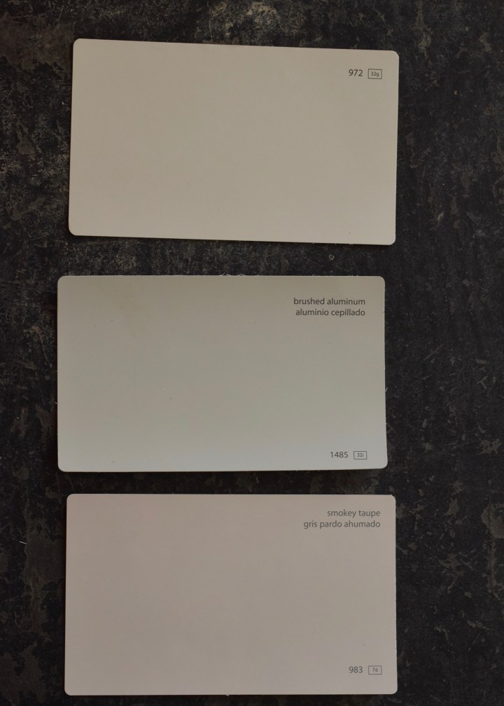
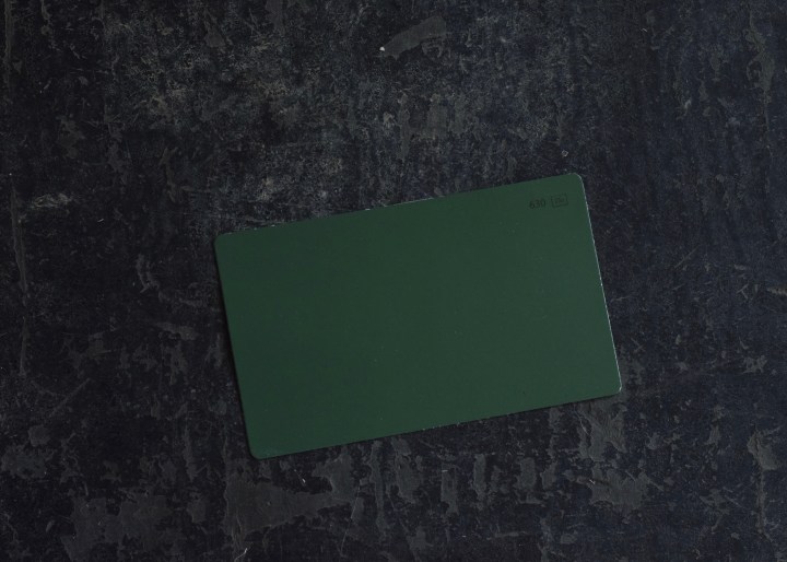
For example, let’s take my living room paint color: Benjamin Moore’s Brushed Aluminum. By itself it looks like a grey paint right?
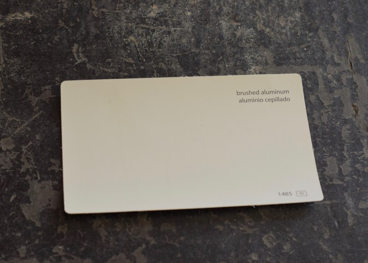
In person the color is a bit of a chameleon and changes depending on the light and time of day. See how warm the color is here?
And then a week or so later in brighter light, it looks so much greyer!
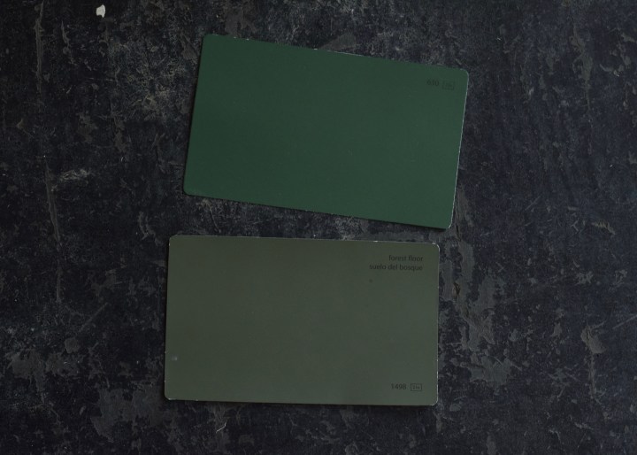
If I compare Brushed Aluminum to two very similar, but warm colors, it looks greyer than them and reads almost green. This is because it has green undertones. See how the paint above looks more yellow and the paint at the bottom looks more pink? Here are three barely different shades of paint with very different undertones.
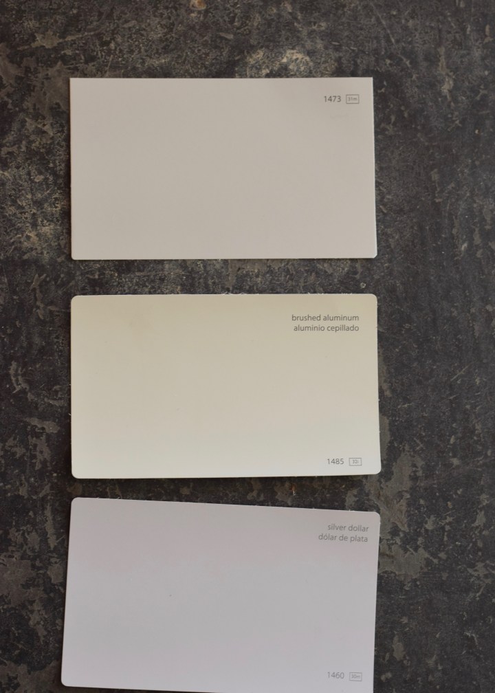
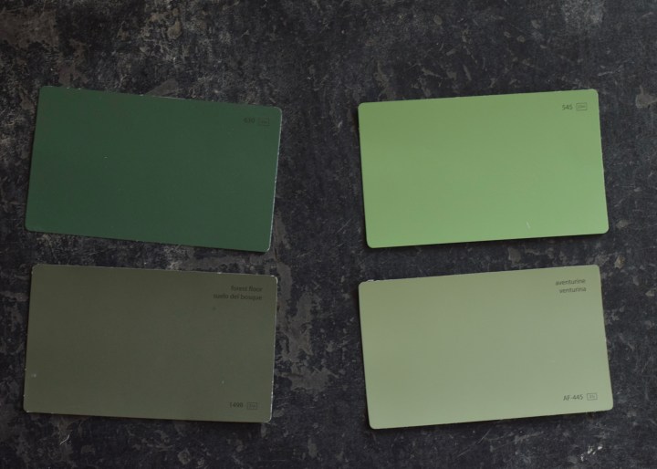
Now if I remove the top and bottom paint and switch in two paints that are cooler greys, you can see how despite the green undertone, Brushed Aluminum (in the middle again below) looks much warmer.
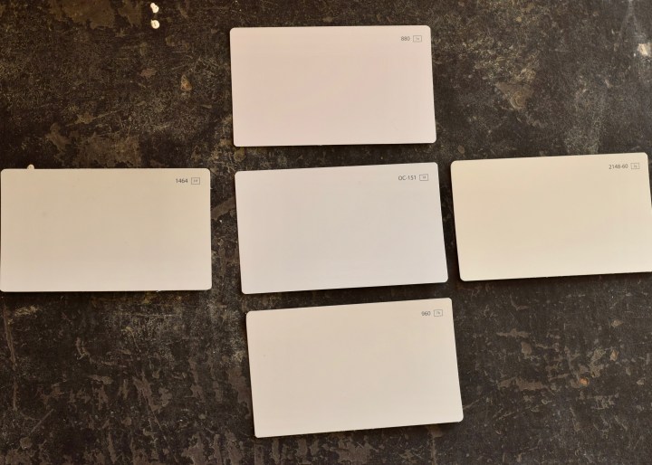
Whenever I want to compare undertones I pull a ton of similar paint colors and lay them out together, when you do this, the paint undertones are suddenly super obvious. Would you believe all these colors read as light grey when by themselves?
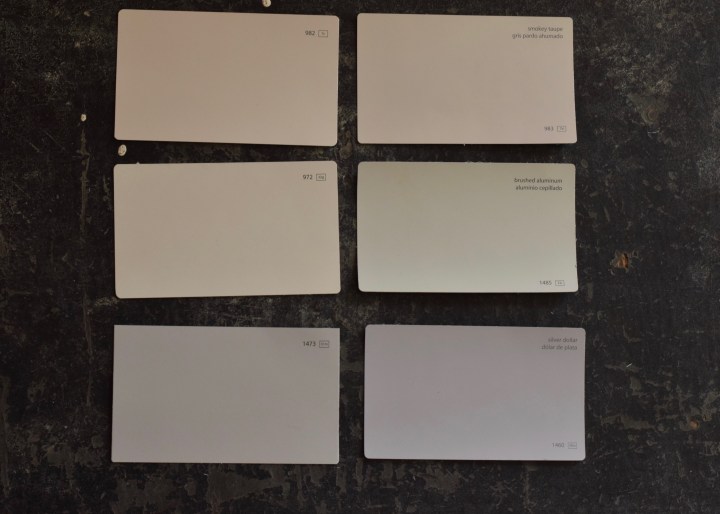
In general you want paints throughout your home to have similar paint undertones, or at the very least, not complementary undertones. When you have complementary undertones with neutral paints, you end up having the undertones read stronger than the paint color and things look off. So if your neutral wall color has yellow undertones, look for similar undertones in your trim and accent paints.
Compare Similar Colors
What I see a ton of today on the interwebs is white. White paint, white walls, white furniture, white houses. Boy, that’s a lot of white! And most of the time, those whites being selected are SUPER BRIGHT with almost no tint.
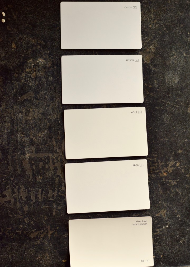
Ironically, as an interior designer, I rarely see another designer pick a super-white white. In general — and specifically in the Pacific Northwest –designers pick a white that has more of an obvious tint and undertone. This prevents white paints from looking dingy or stark in greyer or lower lighting situations. In a city famous for its rainy grey skies like Portland, we tend to pull whites with warmer yellow undertones. Mind you, these paints are still “whites” and not “off-whites.” One of my favorite white paint colors is Benjamin Moore’s White Dove which has just the perfect amount of warmth to it without looking dated.
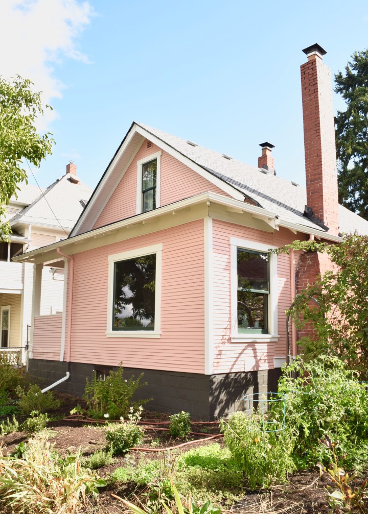
Test a few different whites and take a closer look to compare the different options on your wall or trim. Does that white still look good in the corners? Does that warmer white actually look better with your wall color? My exterior trim paint is actually a very warm white — Sherwin Williams Creamy — but still reads super crisp.
Paint Sample Swatches of Different Colors
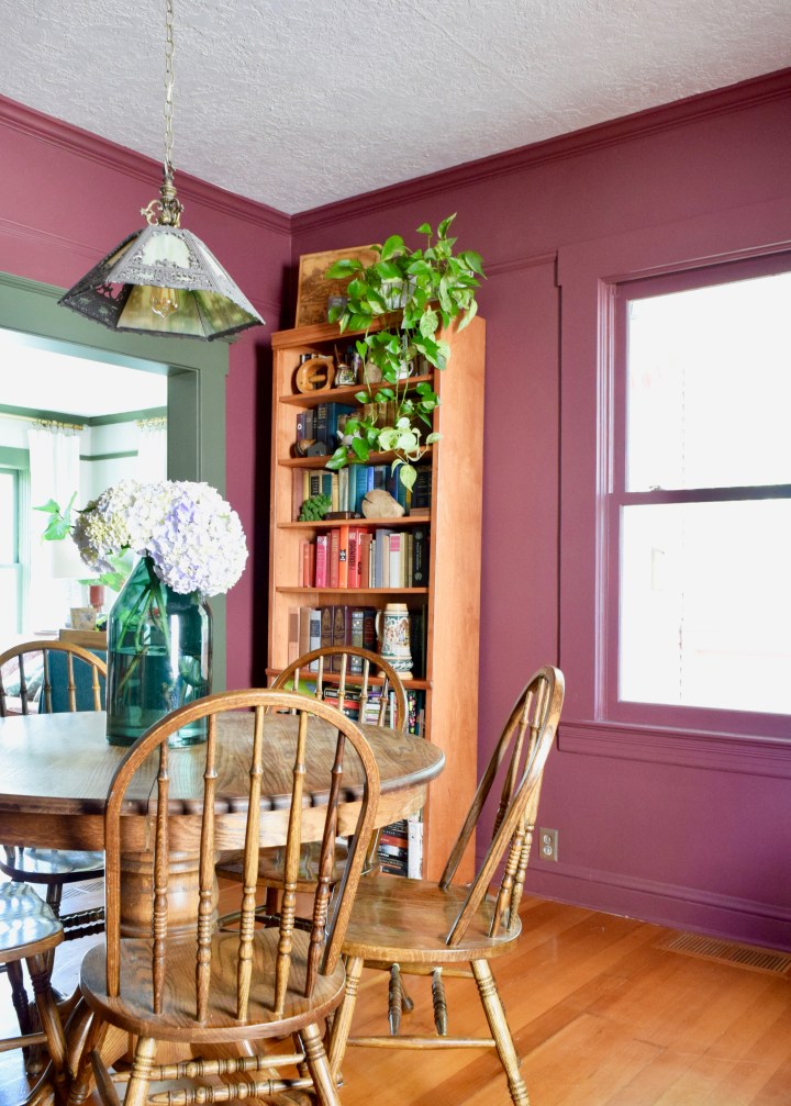
I cannot stress enough how important it is to swatch a bunch of paint colors! I had 7 colors swatched on my dining room walls before finally settling on Benjamin Moore’s New London Burgundy, which just happened to be an outlier paint color I pulled on a whim.
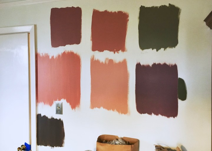
It ended up taking home the prize because of how it compared to all the other swatches. I realized the deeper tone would work much better with my orange toned floors and green trim. It turned out to have so much depth in person and really created a jewelbox space off my living room.
If I hadn’t swatched a number of different paints, I probably would have ended up with a very different color for this space.
Choose a More Grey Version of Your Color
One thing a lot of people do when picking paints is select the most true version of the color they want. Sometimes that’s perfect, but often it’s a mistake.
Without scrolling up, would you say this green is similar to my living room trim color?
Nope. It’s a way more intense hue! Compare below. See how the bottom swatch (my house trim color and main bathroom paint color) is a lot greyer in tone?
It’s one thing to have a color like this in a painting, but it’s another to have that bright color on all four walls of your room! They feel very primary and clownish.
Grey down the color you like as much as you can until it’s just hinting at that original color. So if you like either of these top greens, pick the color below it and that should be your paint. This works for everything: walls, chairs, etc. You want a more complex color than the more primary shade.
Same thing with these pinks and reds: like the left color, choose to paint the right color.

Paints that haven’t been toned down with grey are overwhelming in a space. The greyed down versions don’t detract from the hue, but rather add a layer of depth and sophistication.
Choose a Color Based on an Object You Already Have
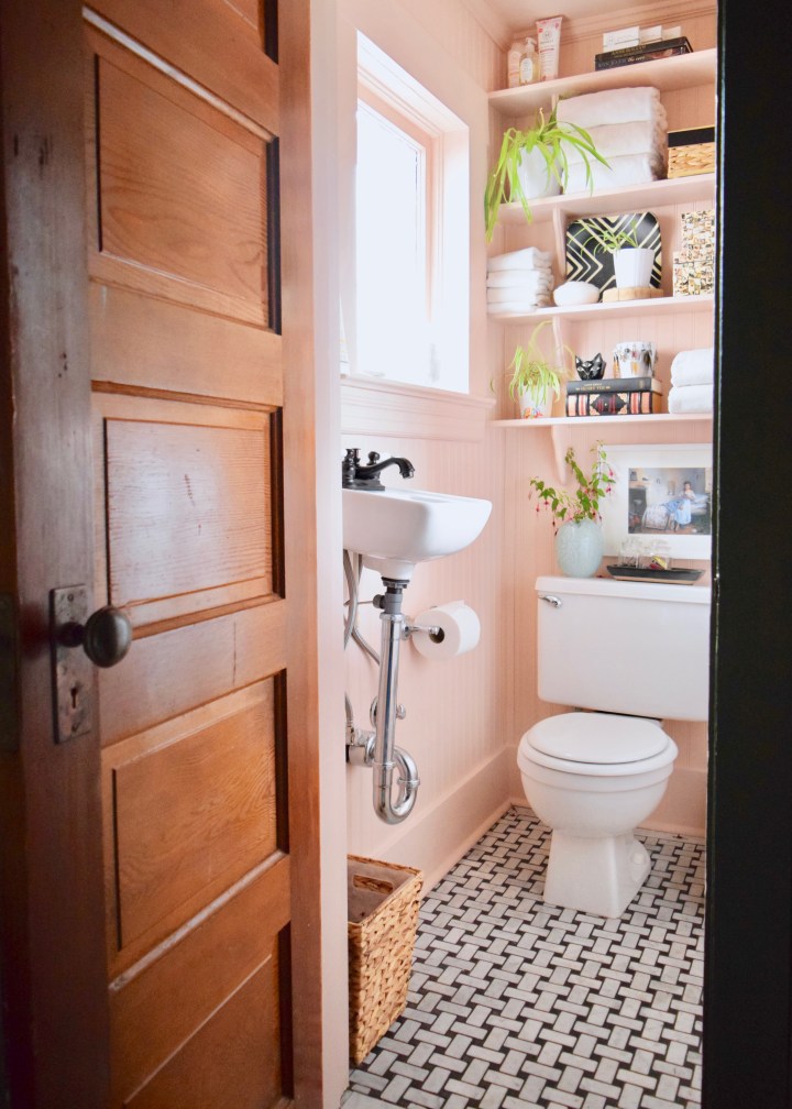
This is a great trick! If you love the fabric of your dress or have a favorite lamp, use that object to pull a paint color! For my tiny Master Bathroom renovation I pulled the paint color from a tiny accent on the capiz shell covered boxes on the second shelf. Can you see it there below?
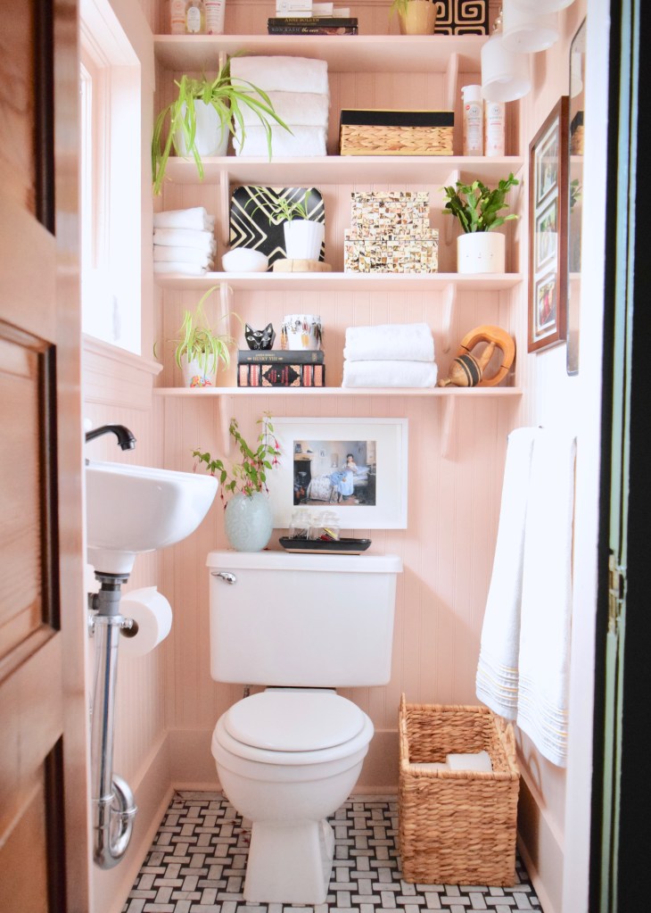
Not only did this way of choosing a paint color ensure those boxes look great in the room, but it also helped to find a paint color that was the perfect amount of saturation. This color looks like flesh and very boring by itself, but in person it’s magical and make the whole space glow with pink light!
Picking a paint color from another object often helps you grab the toned down hues, so it’s an awesome trick!
Guidelines for Picking Paints
Now, who’s off to pick some paint colors? I made a guide for you!
I’m a sucker for Benjamin Moore and Sherwin Williams colors and I’ve already shared my whole house color palette. Tell me in the comments which room you’re painting next! I want to hear which color you’ve got planned for the space.

That’s a good idea to choose a greyed down version of the color you like, as it can look less overwhelming once it’s on the walls. I’ve been thinking about having my living room and kitchen repainted. I wanted to go for a peachy color, so I will keep in mind to look for one that is a greyed down.
Yes! Definitely look more in the grey peach family. If you go with Benjamin Moore – take a look at Pink Beach (my master bathroom color) and compare it to similarly saturated peach-ier colors, that might help! xo – LO