It’s PIIIIINKKK!!! My house is painted pink!!!

It’s PIIIIINKKK!!! My house is painted pink!!!

I give up on trying to call this color coral, it’s absolutely pink and it’s ALL OVER MY HOUSE! That’s right, y’all, Berrybrier is finally painted! It’s been a journey – a rough journey – to get here and I’m so glad to show you this today! My house finally looks like a home, like someone loves it! Remember what it was like when I bought the property? Partially blue with a white corner and lots of flaking paint, it hadn’t been updated in 30 years. I saw a very similar picture to this on the listing and instantly knew this place was my house, my future home. It’s a good thing I’m totally crazy, because normal people don’t fall in love with exteriors like this!

Continue reading “It’s PIIIIINKKK!!! My house is painted pink!!!”

Painting Blues

Painting Blues

Ages ago, I talked about trying to decide which color coral to paint the house at Berrybrier. The windows when I bought the house were aluminum clad exterior / wood interior windows. The aluminum exterior was a dark forest green with slight blue undertone which dictated my color choices on the rest of the house. In the end I decided on coral and dove in whole-heartedly with no looking back! I was attempting to schedule the exterior painting around the same time as the bathroom demo, new plumbing, electrical work, and roof replacement. So I was a little busy and things were a little crazy!

I was stressed and stretched thin; but my mom was in town and she volunteered to interview painters while I was at work. It was a huge load off my chest! Unfortunately it turned out that painters are extremely difficult to find and extremely flakey. My mom finally found some people after a few weeks: a married couple with their own painting business. The lady called me about 4 times to schedule a time to meet to sign the contract. This should have been the first weird sign. But the house looked terrible, my mom thought these people seemed good, and I was ready to paint it pink!

Berrybrier | Roof

The woman came over one night last October – a hot October – to sign the contract. It was the very end of painting season in Portland and she wanted to get started ASAP. I was all for it; I couldn’t wait to see the house all in coral. We walked around the house and discussed various things that night: exactly what I wanted painted the white trim color and what I wanted pink, some trim repairs on the back of the house, prep work needed, and payment. We also discussed timing, since the dormer was still being built, the roofers were still at the house, and the electrical was just beginning to get started. I had bought the paint – Sherwin Williams Emerald – during a big yearly sale, so that had been taken care of. The painters were charging about $4500 for the labor for the job which felt like a great deal. They asked for 50% upfront, which was pretty standard with how I was paying most of the various workers on their projects at Berrybrier. The painters were going to start the following week. I ponied up.

The first day of that week, the electricians shut off all the power at the house to do their extensive work. I probably should have guessed that that would happen, but I wasn’t expecting it since they hadn’t told me specifically to expect this. I found out later they didn’t think I was actually living at the house during these renovations! I had to call the painter and let them know that if they needed power to do their work (they did) they’d be delayed three days. This was an issue because the days were getting colder and wetter quickly. We pushed three days which brought us to a Thursday am start.

The plumber started his work in the bathroom that Wednesday. It was supposed to be a half-day job, the water was off at the main line to the house. Of course, with Berrybrier, nothing goes as planned. The plumbing needed another half-day’s work and the plumber wasn’t available again until that Saturday. This meant no water for the painters’ sprayers. I called the painters again, I asked if they could use water pulled from a hose from the neighbor’s house. They refused, saying they needed too much water for that and would rather push their work. That was a little annoying since access to water is access to water, but they were understandably annoyed at the situation. And I was too. This was convenient for no one! However, they were able to work on the house as soon as the water was turned back on. They planned to start work that Sunday and complete as much as they could on the house in the week of sun that stretched out. I was called out of town that weekend, last minute. I was excited to get back and see the progress on the house!

I returned home the following week, mid-week. Nothing had changed at the house. It did not look like anything had been touched on the painting. I called the painters confused. They told me they had found out they were having twins and were in a state of shock. I had not realized the woman was pregnant when she had come over to sign the contract, so this surprised me. It also frustrated me since we’d been discussing our tight timeline to paint the house. I’m all for mom and pop businesses, but it’s also important for these small businesses to be professional. The real bummer? This no-show thing soon happened again and again.

Several times they promised to paint, several times they didn’t come. I was majorly stressed as my insurance company demanded the house be painted by the end of November. Finally, they got it to the stage where the house was primed and the painters agreed to write my insurance company a letter assuring them the house was painted and water-tight. Thankfully, the insurance company agreed that this was sufficient and extended my painting timeline to October 2018 (a full year extension)! But we were still pushing to paint on the sunny days that fall. Unfortunately the painter still rarely showed and his team of painters were non-existent. One person was trying to paint the entire house in a couple of days. This person also decided to spray all the trim and then brush all of the siding. And then he never showed up.

The painters then refused to fix the window trim on the back of the house and refused to remove the silly little old alarm speaker on the front of the house. They refused to clean up the excess cable wires that were all over everywhere. They weren’t doing basic things like filling the holes from the old stair railing (dime sized holes!).And they continued to not show up when they promised to.

Berrybrier | Big Holes.jpg

Other brand new things like the smooth, new electrical pole on the side of the house were painted, but covered in drips. It looked terrible and definitely not like it had been done by a professional!

Berrybrier | Electrical Tube Drips.jpg

On December 9th, after the painter again did not show up. I took a hard look at the house. It looked terrible and it was increasingly clear in the areas that were “complete” that the prep work was insufficient. Some of the areas that had been primed had sticky oversaturated spray in places. I was extremely stressed, upset, and felt helpless. I talked to my neighbor Erik, he walked around the house and agreed the painters weren’t doing a good job. I sent them a text and told them not to bother coming back to the house, but I’d like to settle up a return of some of my payment. Of course, they fired back that I owed them an additional $600.

Berrybrier | Oversaturated Spray.jpg

I had some painters Erik worked with come look at my house that week. They were shocked by the condition and pointed out a lot of things I hadn’t even noticed before. They said the house would now be more work to properly paint than before. That blow added anger to the stress and exhaustion and unhappiness with this project. Combined with a non-functional bathroom, ripped up kitchen, and way too many other projects to count I was a pretty big mess.

Berrybrier | Flaking Paint.jpg

I had another painter, this one referred by my Uncle Scott’s Uncle Dan (a local contractor) over to take a look. He concurred, the house would now be more difficult to paint than before the other guys had started their work and created this mess. Cue the tears and feelings of loneliness and utter despondence. Daniel’s post on the renovation of the side of his house sums up these renovation feelings oh too well! It was a very low point and the house looked horrific.

Berrybrier | Flaking Eaves.jpg

Winter was already here; my house was covered with papered windows and oversprayed trim. It was an extremely obvious and embarrassing way to leave the house for the winter, but there really wasn’t an alternative. So gutters covered in plastic and patchy front paint and overspray it was!

Berrybrier | Fall House 2017.jpg

Even the snow did not make the house look any more charming! Passersby would jokingly ask if I’d changed my mind on which color I wanted. I’d taken a house badly needing painting and made it into a roadside attraction horror. It was mid January before I took all the plastic wrap off the windows. I didn’t have a ladder tall enough to get to the plastic wrap on the gutters… so that got to stay through August the following year!

Berrybrier | Snow House.jpg

My sister moved into Berrybrier in January 2018 and that March helped me patch the trim over the window and back door where ripping off the porch roof exposed cut up mouldings. This was a small improvement, but every little bit of progress counts!

IMG_0951.jpg

Meanwhile I submitted a complaint to the Oregon Certified Contractors Board against the painters I’d hired and tried to focus on the hefty list of other things I needed to work on. The painting would have to wait until summer 2018 and there was nothing I could do about it. This was a HUGE life lesson and a really unfortunate loss of a significant amount of money. But overtime, the stress reduced, the anger faded, and I’ve accepted it and moved on. Because there really isn’t an alternative is there? Have you ever had huge issues with professionals you’d hired? What did you do?

Winter is Coming

Winter is Coming

Oh my goodnesss! My brain is doing cartwheels, you guys. There is SO MUCH to do and SO MANY things to plan. It’s hectic and insane and oh so much fun. So what’s going on at the moment? Just a few things:

  • A new roof is going on and so is a dormer!
  • The exterior of the house is being prepped for painting.
  • We’re redoing the kitchen floors… slowly, but surely!
  • I’m designing the bathroom and getting ready for demo.
  • The garden is being worked on, weeded, and seeded with clover!
  • Electricians are scheduled and I’m selecting new light fixtures where needed.

Whew! I’m exhausted just recounting this. Each of these things has taken a whole bunch of time and planning, thinking and rethinking. I’m just a tad stressed and just a tad tired and just a tad sore, but most importantly I’m happy. The major stress lately, however, has been getting the exterior of the house in shape as soon as I can. Because winter is coming. And although Portland winters are not nearly as bad or as long as those in Westeros, you may have heard the rumor that it rains here.

Well, the rumors are true my friends, it rains here in Portland! Which means the roof issue needed to be addressed first. I spent weeks thinking up a plan and drawing up construction documents in CAD. Luckily the City of Portland has a Homeowner’s Permit Night where you can bring drawings to review with their structural engineers for tips and information as well as get permits during non-business hours. I spent two consecutive Thursdays in those offices the first talking with a structural engineer about how to best support the dormer and the second evening actually getting the permit. In between those two Thursdays I spent many, many hours working in CAD to get my drawings ready for approval. It was a huge relief when they passed and I was able to get my permit! The most frustrating part of the process was the long hours on the computer when I really wanted to be at Berrybrier sledge hammering something.

After my drawings were done and the permit procured, I had to select a roof color so the roofers could begin, but how to select a color for the roof without selecting a color for the house? Well, let’s go back to the pictures of Berrybrier. It’s a bit difficult to see in pictures, but the windows of the house are dark green. On the plus side, a previous owner updated all the windows to double-paned, vinyl-exterior, wood-interior windows which is *almost* what I would have selected myself. If it was me, I’d have selected wood interior and exterior windows. But, alas, what’s done is done and I don’t have to do it! The decision for dark green, vinyl-exterior windows though is a pretty permanent one. As these windows can not be painted, I had to pick a paint color for the siding that would coordinate with dark green.

Berrybrier Before | Land of Laurel

What goes well with dark green windows? White? Hmm… an all white home with green windows would be classic. White siding paired with white trim is also very popular right now. I found this inspiration photo which shows a house with white trim and siding, the windows are dark brown here, but you can easily imagine them as green. You can barely see the roof here, but it looks to be a dark charcoal.

White house and Trim | Land of Laurel

source

As classic and lovely as this is, it is very popular. Would I recommend it to a client? Absolutely. But, for myself, I wanted something a bit more exciting. I wanted something happy. A house that makes you smile just walking by it. What is colorful and happy that goes well with green? Coral! And coral is another name for salmon and salmonberries are delicious and the house is already called Berrybrier, so really, could there be anything more perfect? (Did you see how my brain works there?) So! A salmonberry colored house it was. Luckily, I had the perfect inspiration in mind.

Young House Love, my favorite blog, bought a beach house last year and they painted it coral! Their house is too cute and much more charming than Berrybrier, so it’s the perfect inspiration. Their home is in the final stages of a complete renovation (which is incredibly exciting to follow) and it’s just too cute!

Young House Love

source

Luckily, they documented their careful color selection process and I followed their journey from paint swatch to paint swatch. They landed on Sherwin Williams 6324 Mellow Coral. I was determined to take this into consideration, but select something different. I pulled a ton of samples from work. At first I thought I’d go much darker, but eventually I came around.

Coral Colors | Land of Laurel

Bold colors tend to look even brighter on larger surfaces, so it’s important to select ones that go much more grey than you’d originally think. I ended up landing on Sherwin Williams 6611 Jovial. I picked up a color test pot at Lowe’s and popped some swatches on the house. Instantly it was bright, happy, and colorful!

Jovial | Land of Laurel

It looked good by the door, bright and happy. It’s always shady here and since this is the main way you get into the house, it’s an important view. Of course, it would look even better if the trim wasn’t filthy dirty!

SW 6611 Jovial | Land of Laurel

Still, I wasn’t sure. What if it was just a tad too bright? I brought in a back up swatch: Young House Love’s Sherwin Williams 6324 Mellow Coral. You can see below it’s just a little duller and a little more grey/brown in tone.

Paint Swatches | Land of Laurel

So although I had a color selected, I did not have the exact color finalized. I’m still debating endlessly. Mellow Coral is safer, it will clearly look bold on the home. Young House Love’s beach house is happy and absolutely colorful. Jovial is happy, just subtly different from Mellow Coral, and just a tad brighter. But is it too bright? What do you think? Which do you prefer? Which would you choose?

Luckily, although I’m stumped on the color for the siding, the color selection for the trim is easy: SW 7012 Creamy. It’s a happy white with a warmer undertone which will brighten nicely against Portland’s often cool grey skies.

And the roof? Also a quick decision! I’m going with a 40 year roof by Owens Corning in the Sierra Grey colorway.

Sierra Grey | Land of Laurel

source

This is a nice light grey shingle with plenty of color variation. As Berrybrier has no air conditioning (and as someone who’s never lived in a house with air conditioning I have no plans to add it) I wanted something lighter that would reflect more heat in the summer. Dark colors absorb heat. It’s a basic scientific fact that almost everyone knows. So although dark roofs look fantastic and are extremely popular, I knew it wouldn’t be for me. Something light, bright, with significantly less heat retention would be most important. This picture also from Owen’s Corning shows a look similar to what I’m hoping for with the Sierra Grey. It’s light, but it’s not white and it has plenty of color variation. Decision made!

Sierra Grey | Land of Laurel

Now if only I could be one hundred percent sure about the siding color! Help! What would you pick? Random strangers walking by my house are being accosted for their opinions on paint color and I need yours too!

Paint Swatches | Land of Laurel

Brighter or more subdued?


The Long Weekend

The Long Weekend

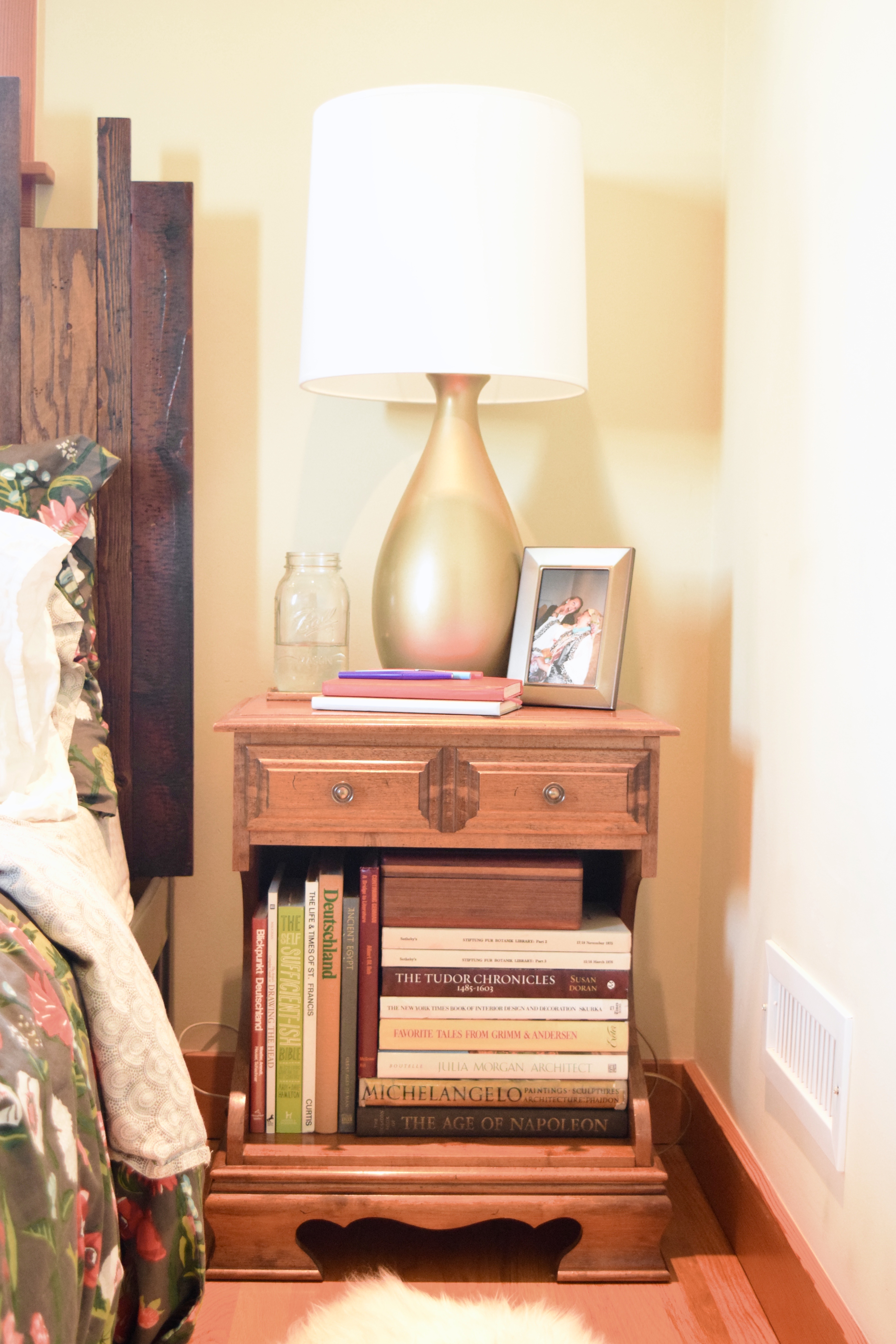
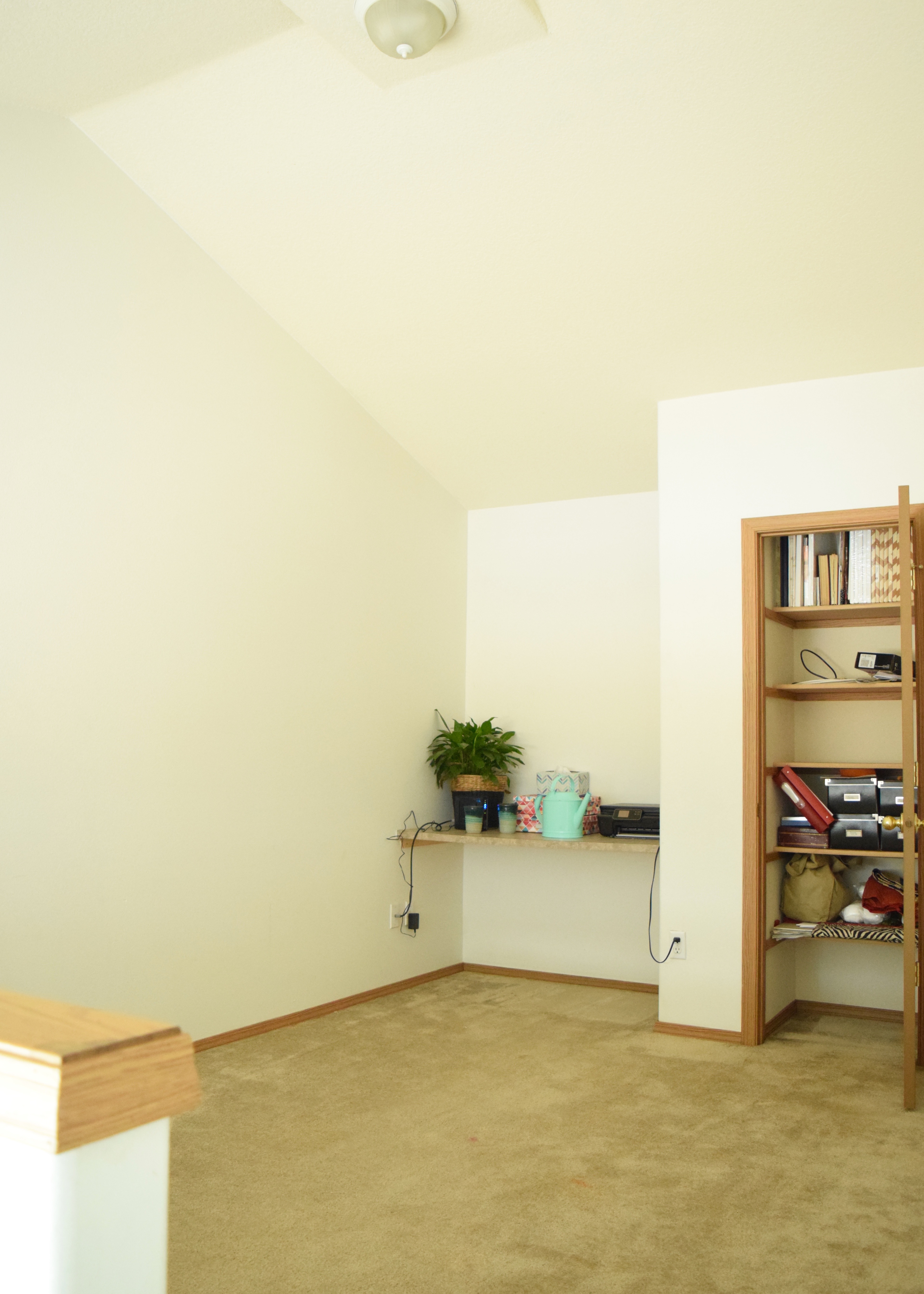
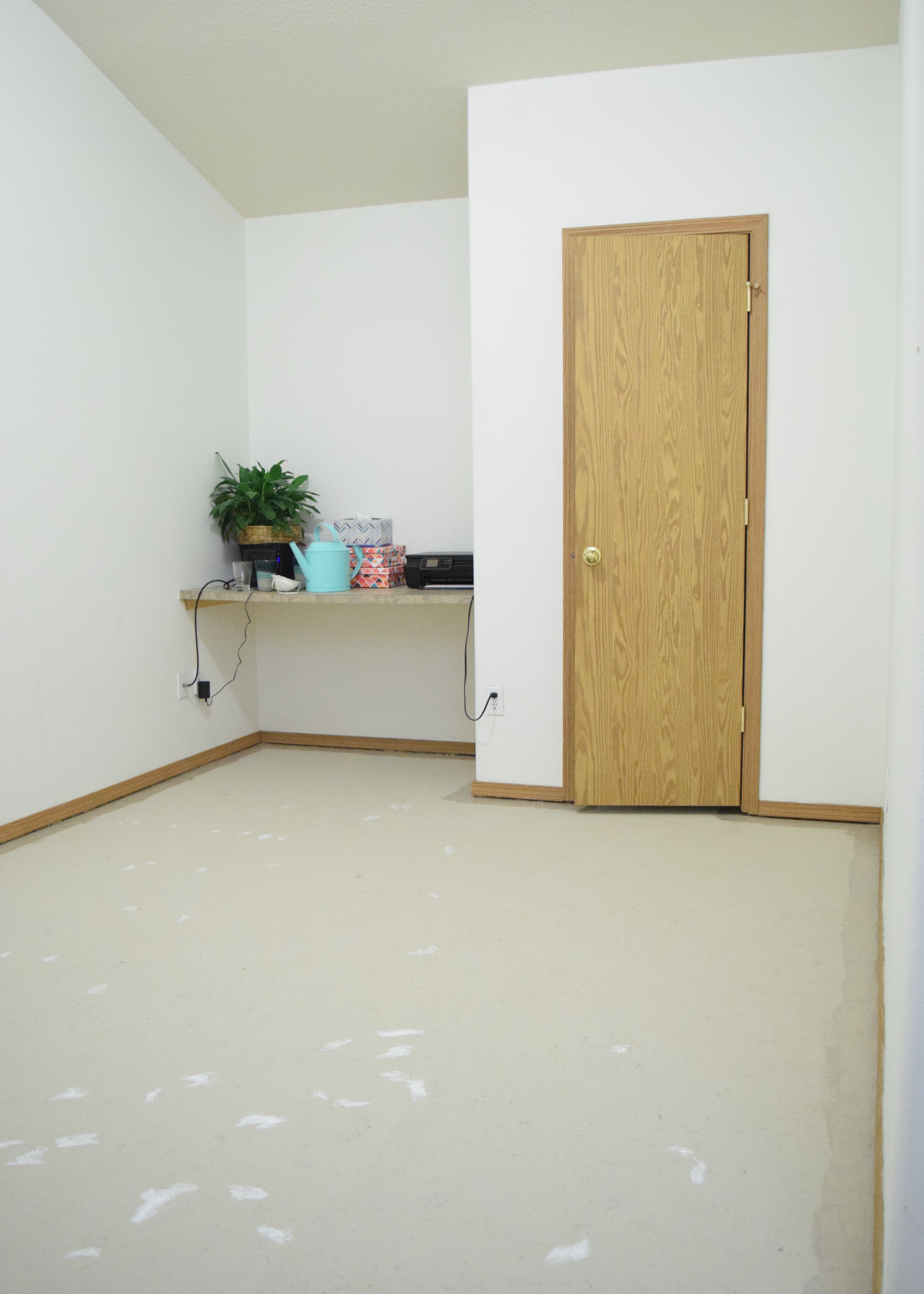
Before we moved in, I walked the Duplex with my landlord and she pointed out several issues. One of those issues was the poorly laid LVT tiles downstairs, the other was the gross, old, stained carpet in the bonus room. She mentioned during this tour that she was considering replacing it with laminate. I heartily agreed. In my opinion, hard surface flooring is the way to go in rentals. Carpet simply doesn’t last and gets gross quickly. For anyone who has allergies to dust or dander, carpet traps dirt and dust and even the strongest of vacuums can’t get it out. It’s affordable in the short term, but over time, the cost of ripping up and replacing carpet adds up quickly.

Fast forward two and a half months. I reached out to our landlord via email and asked about her timeline for replacing the flooring on the stairs and in the bonus room. The carpet was nasty and a little smelly. I’d gone to Home Depot and gotten a quote on the installation and labor for a laminate floor. Home Depot estimated $250 in costs to remove the existing carpet and $850 in labor and materials to replace everything with an inexpensive laminate. The bulk of that cost was in the expensive laminate stair treads.

Unfortunately, life happens, and due to some unforeseeable personal matters, replacing the flooring was no longer in her plan or budget. So I suggested something else. What if I ripped out all the carpeting and painted the subfloor? A quick look around the internet told me I could do this for under $250. I proposed this solution as a way to make me happy in the short run, and allow her to spend on new flooring when she was ready. With her approval (yay! Happy dance!) I planned my attack. It was less than 200 SF so I figured I could knock everything out in a weekend. Little did I know how back breaking that would be.

My weekend commenced and proceeded to look a little something like this:

Friday

5:50pm – arrive home from work

6:00pm – quickly eat left overs from fridge, change clothes

Bonus Room | Land of Laurel

6:15pm – move all the furniture out of the bonus room

Empty Bonus Room | Land of Laurel

6:30pm – begin ripping up all the carpet

7:30pm – finish ripping all the carpet out

Carpet Gone! | Land of Laurel

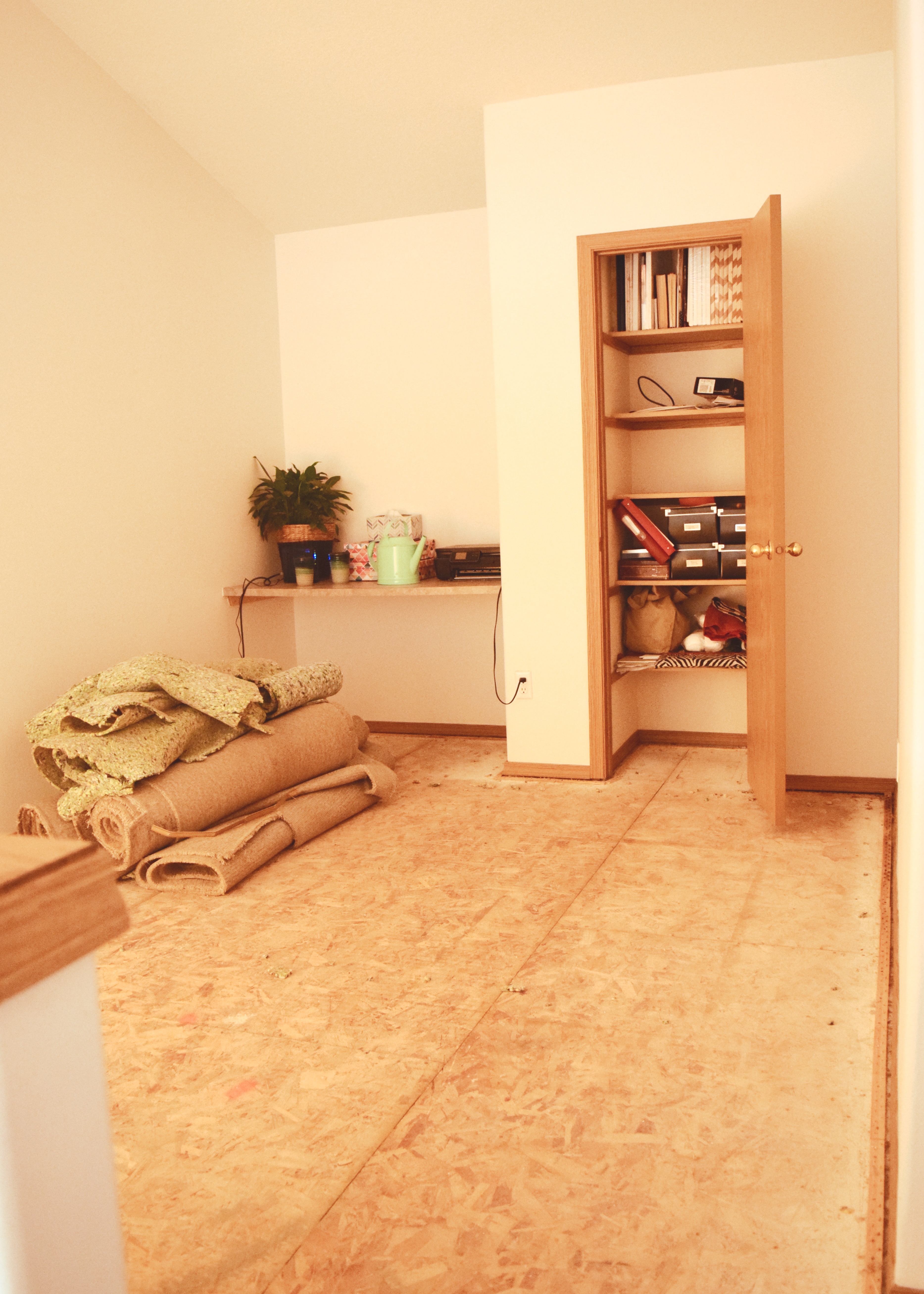
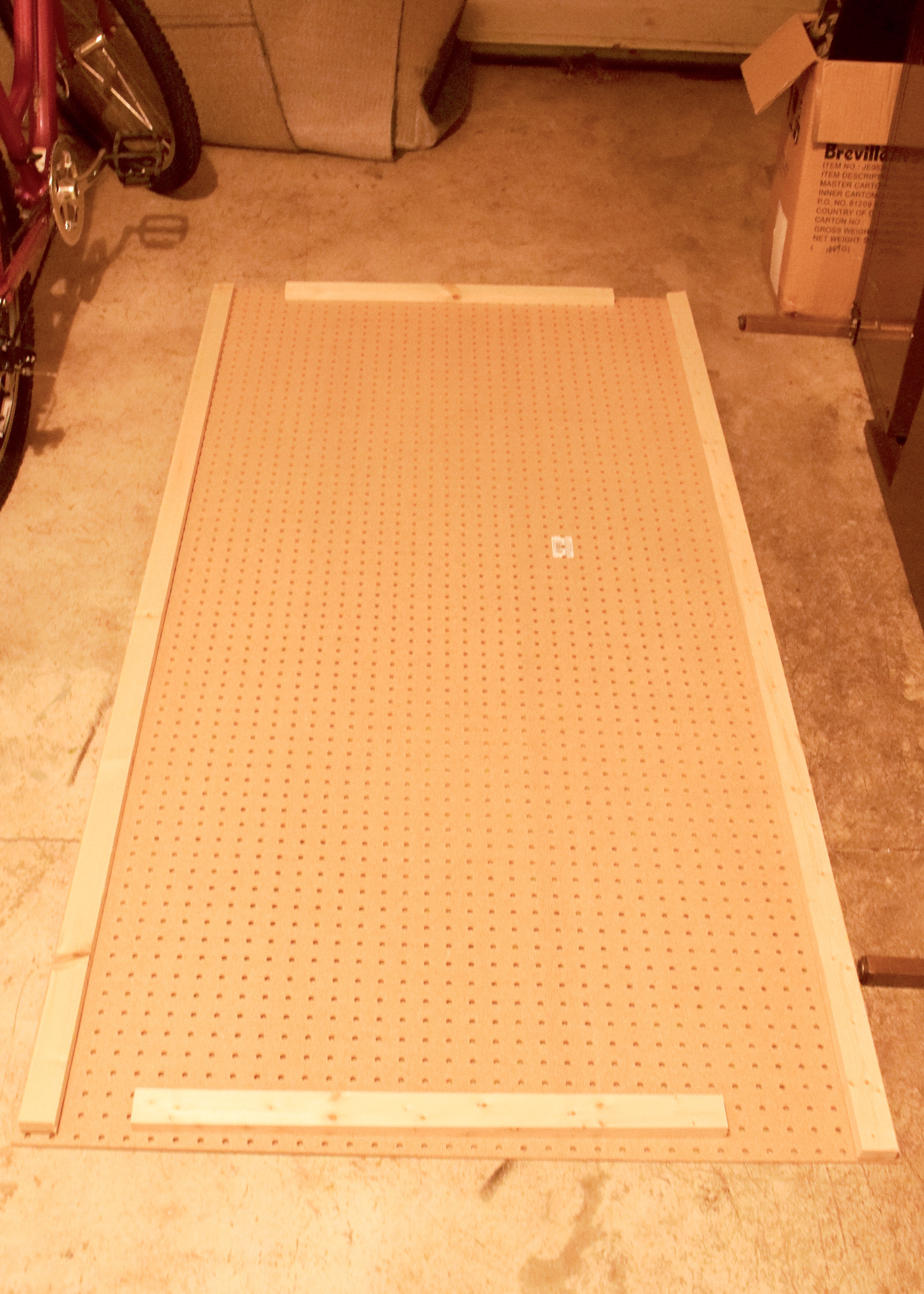
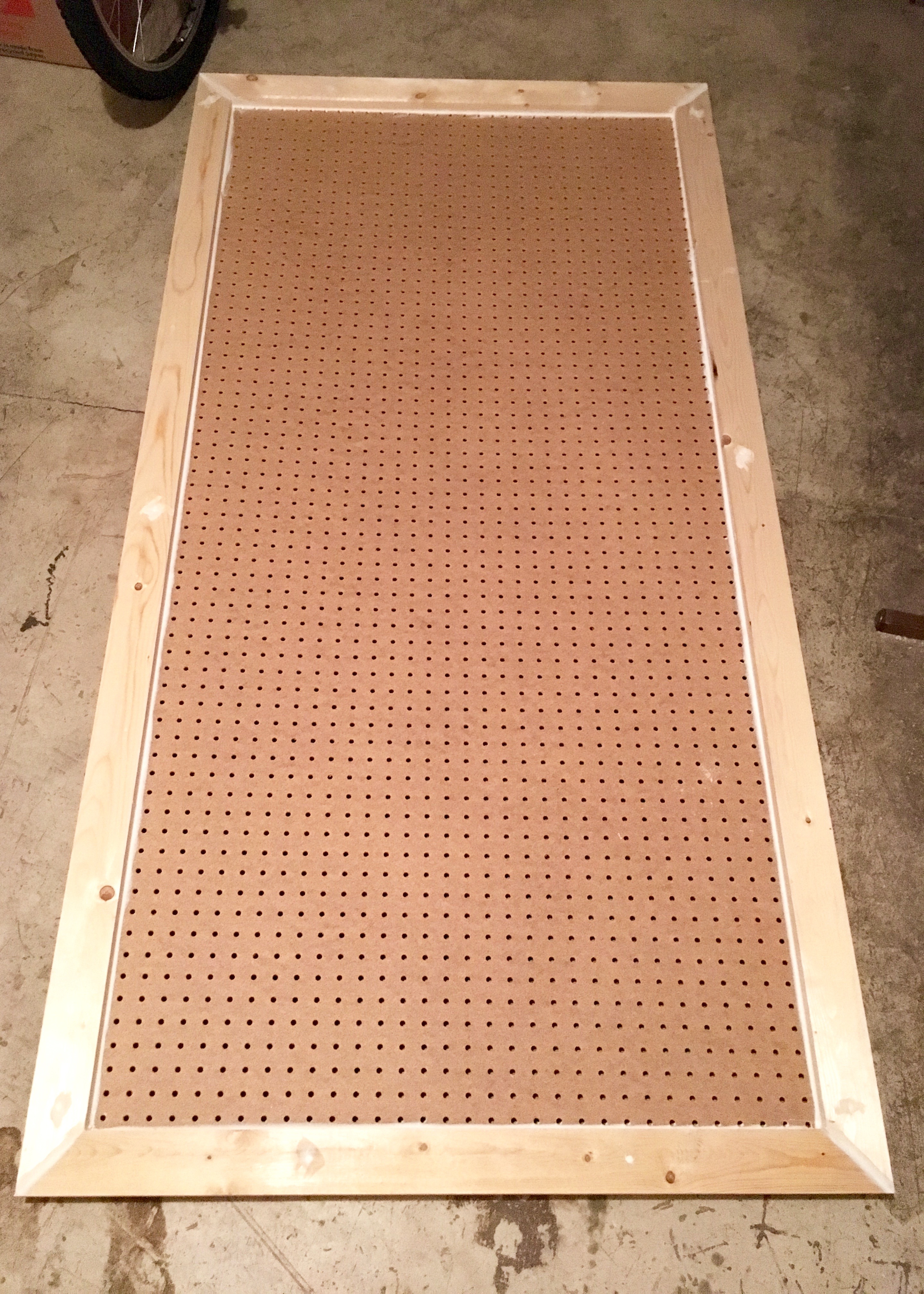
7:45pm – finish ripping all the carpet pad out, try not to gag looking at the amount of dirt that’s been hidden under the carpet for going on 20 years (see brown smears in picture, much more obvious in person!)

Dust Under Carpet | Land of Laurel

8:00pm – finish carting all the carpet and pad into the car (laying it on top of a tarp to protect the van)

Stairs Carpet Pad | Land of Laurel

9:30pm – finish pulling up all the tack strips, add these to the pile of stuff in the car

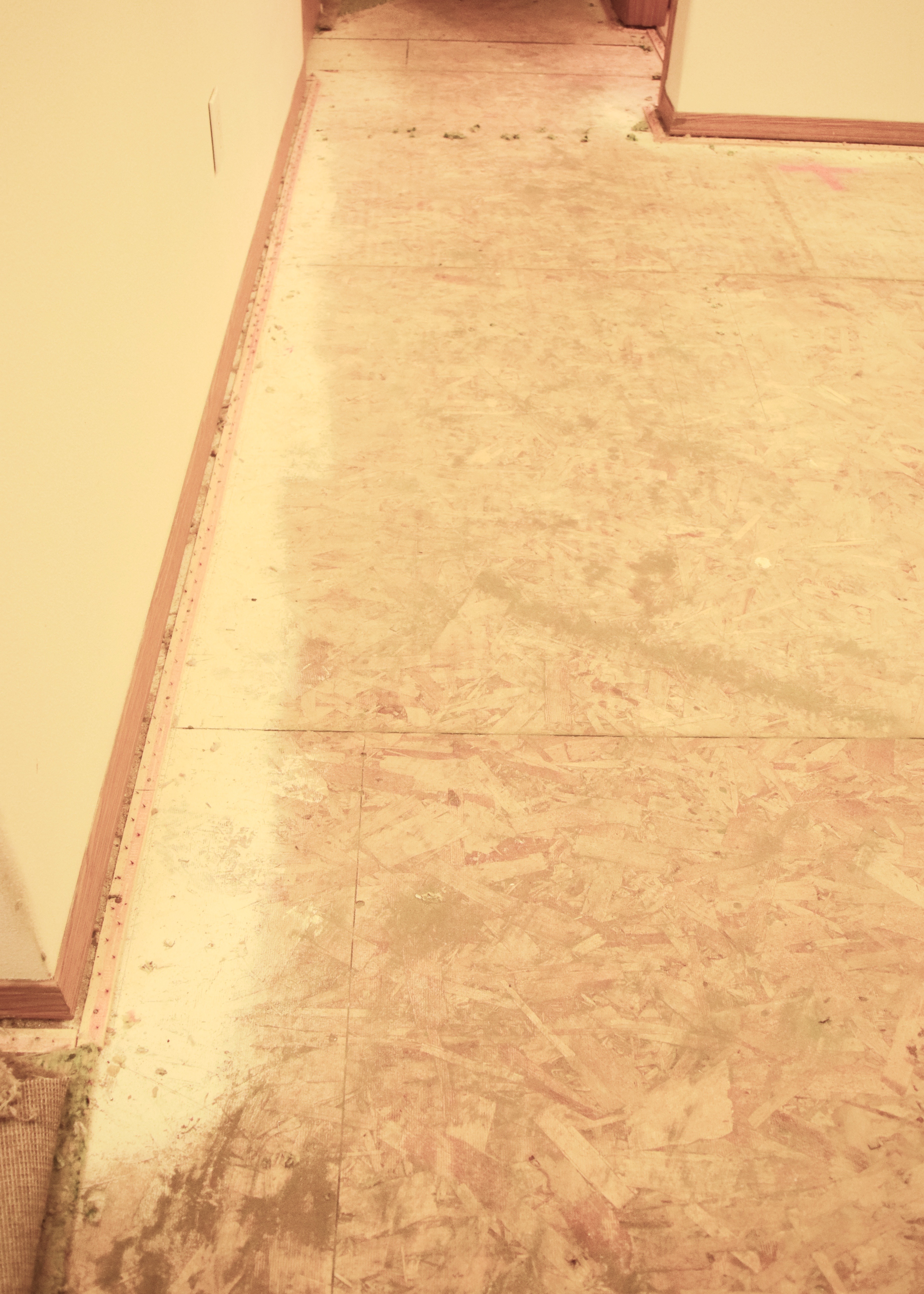
9:45pm – sweep floors

10:00pm – vacuum flooring

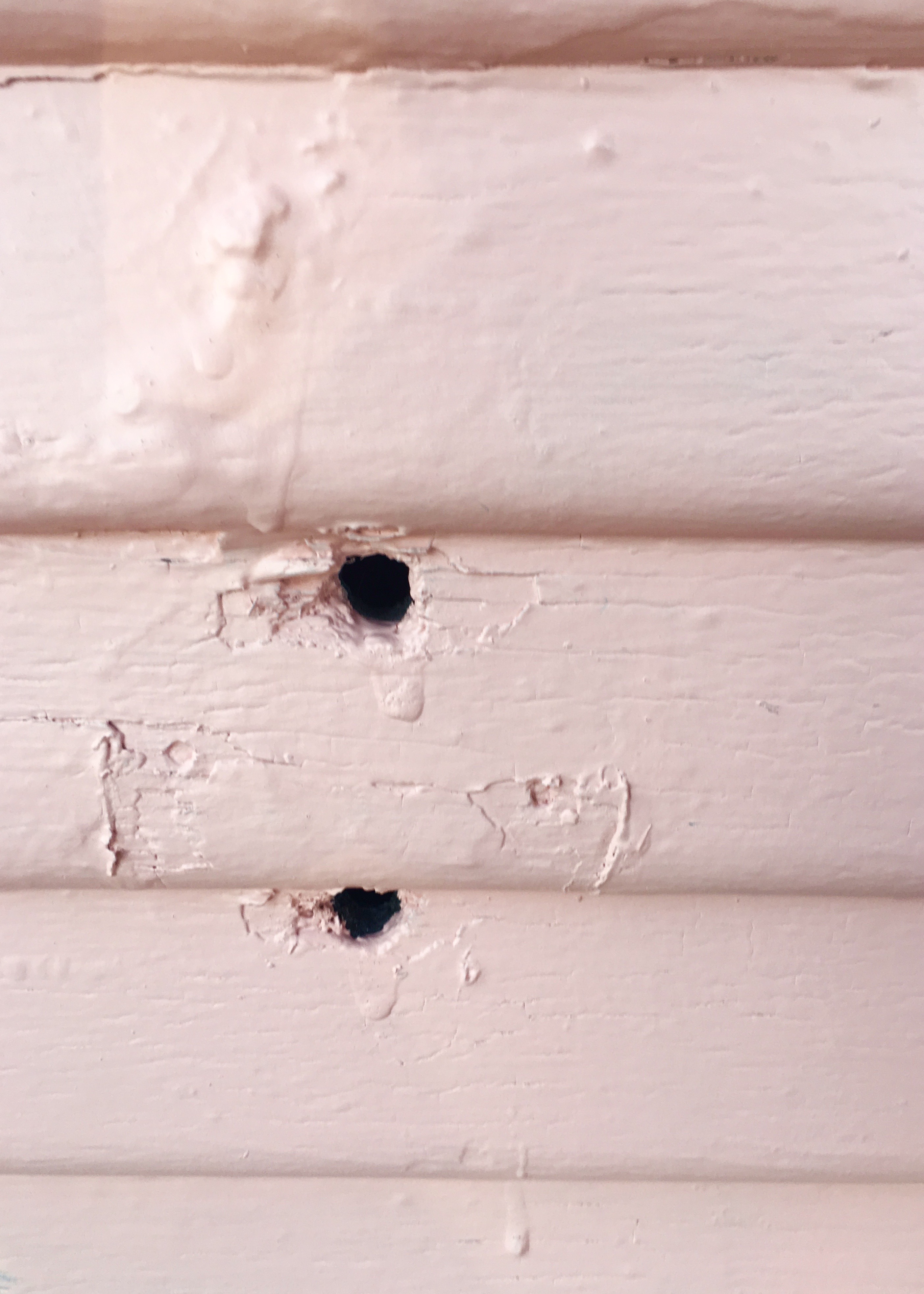
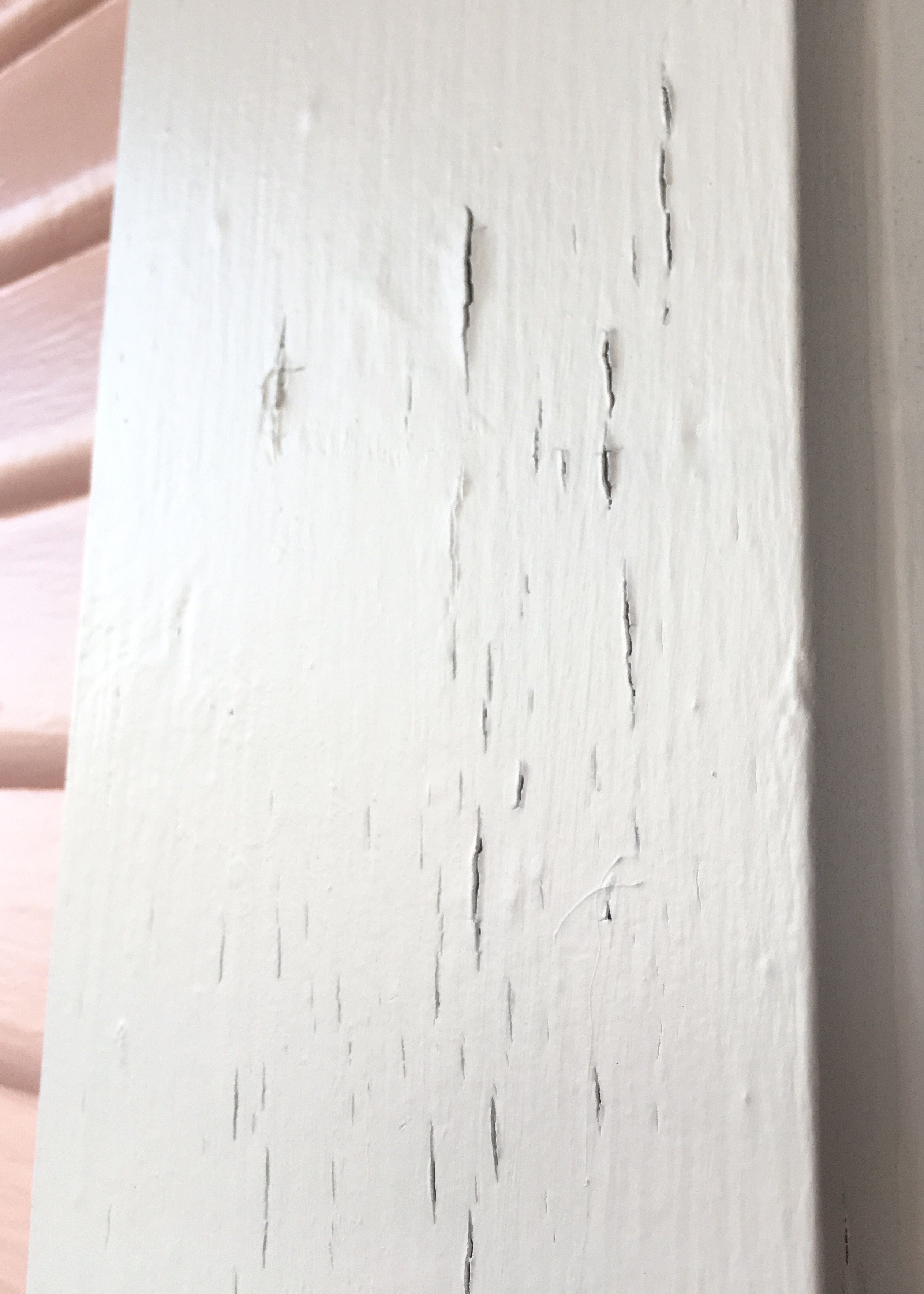
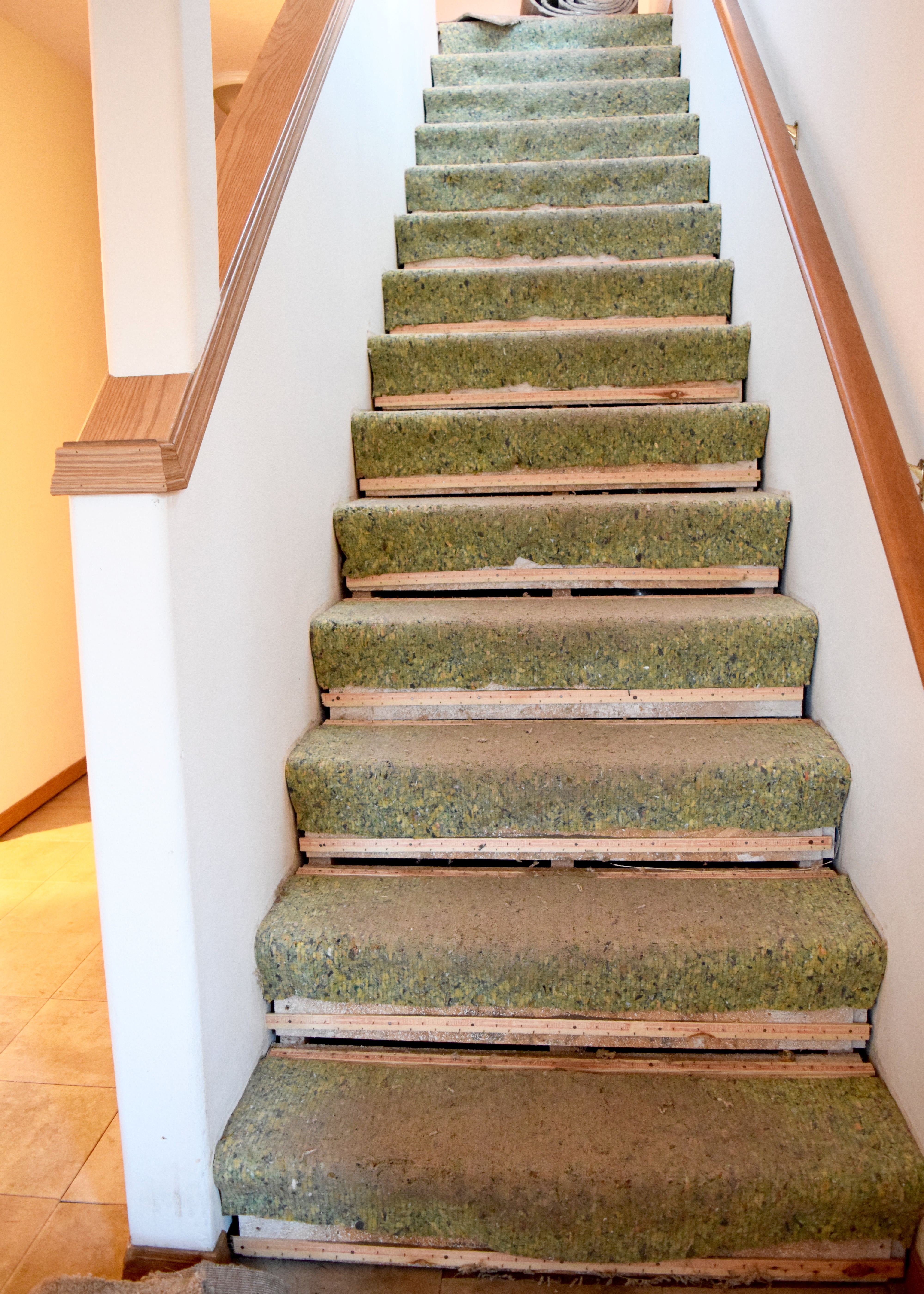
10:15pm – begin pulling the 253 billion staples out of the stair treads/risers with a pair of needle nosed pliers

10:30pm – my roommate comes home and helps pull out staples from the bonus room

11:30pm – roommate goes to bed

1:00am – finish removing all the staples I can find (approximately 589 trillion)

1:30am – fall into bed, showered, but sore

Saturday

8:00am – alarm goes off

8:45am – finish breakfast and dress in project clothes

9:00am – sweep floors

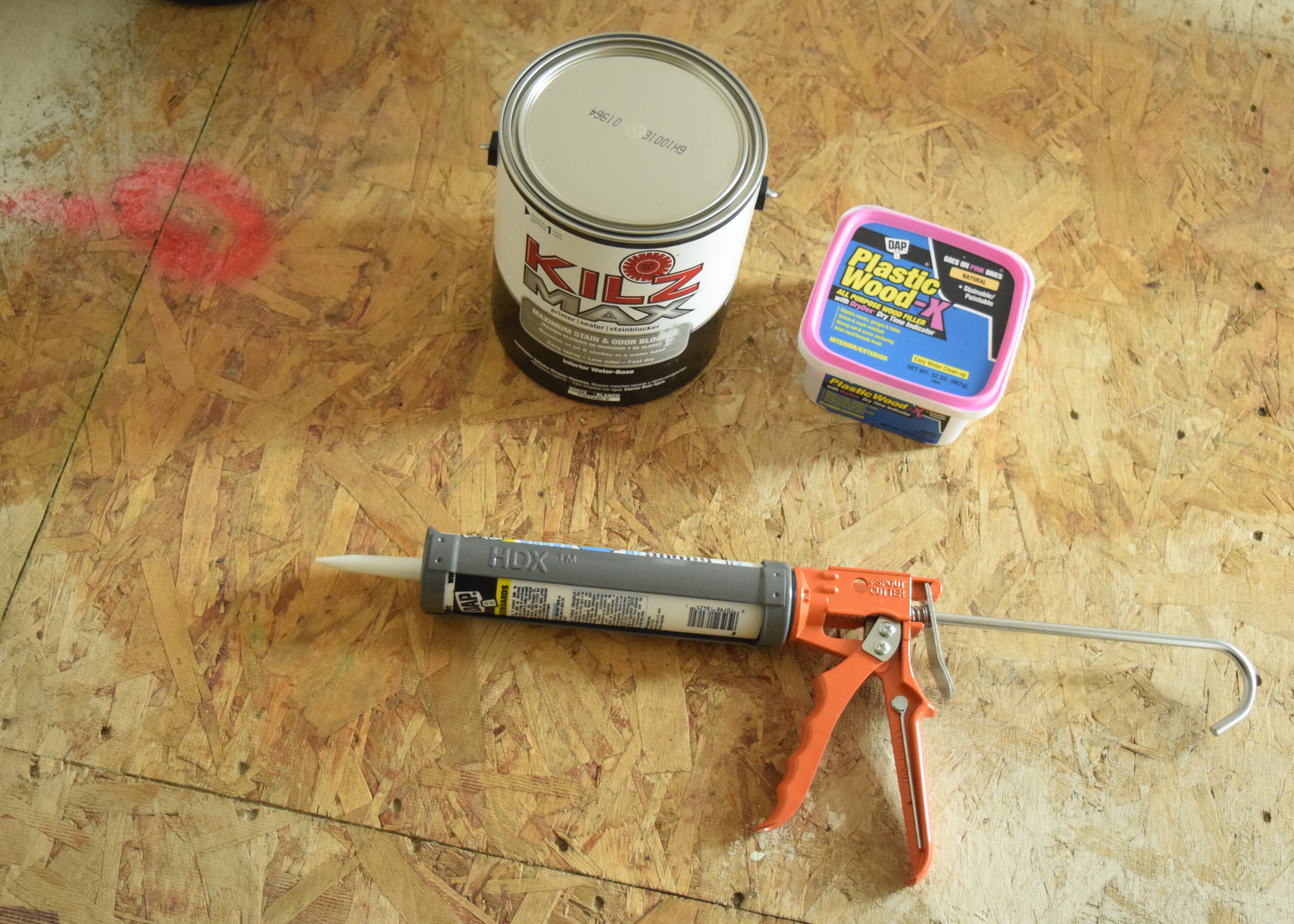
9:15am – vacuum floors, assess supplies, realize I don’t own a spackling knife, hope the tinted primer works well with the paint selection

Supplies | Land of Laurel

9:30am – wipe down floors with wet cloth, remove the 33 million more staples I find while doing this

Ready for Paint | Land of Laurel

10:00am – run to Home Depot for spackling knife

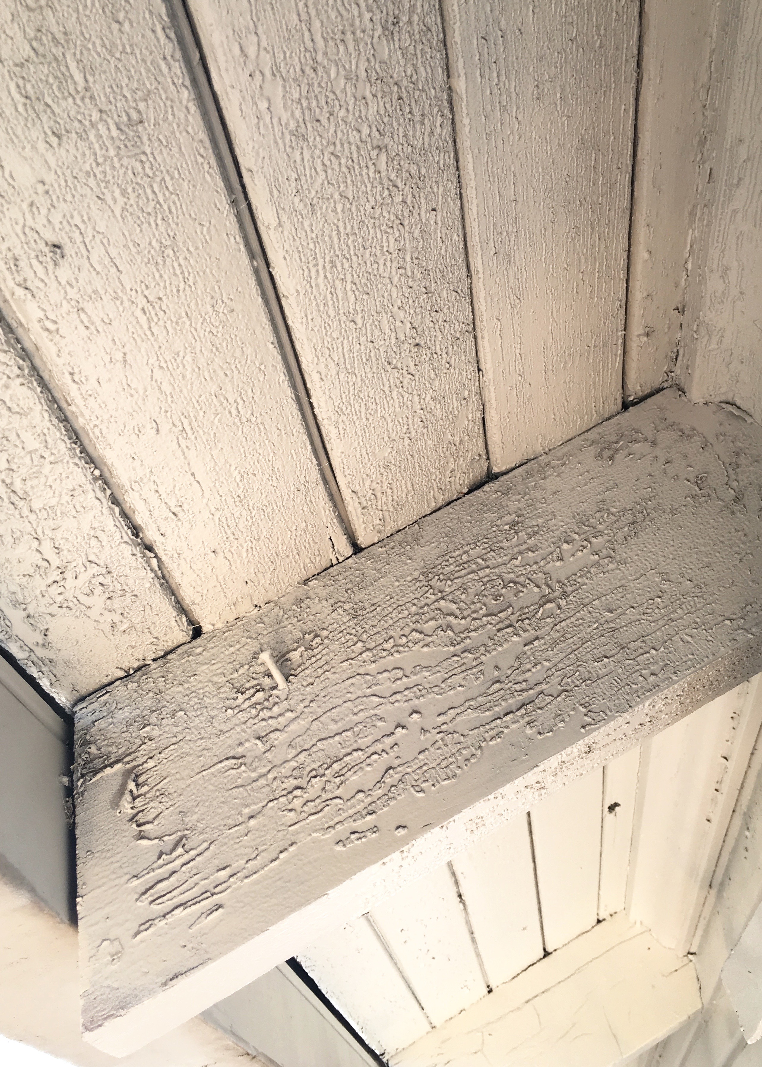
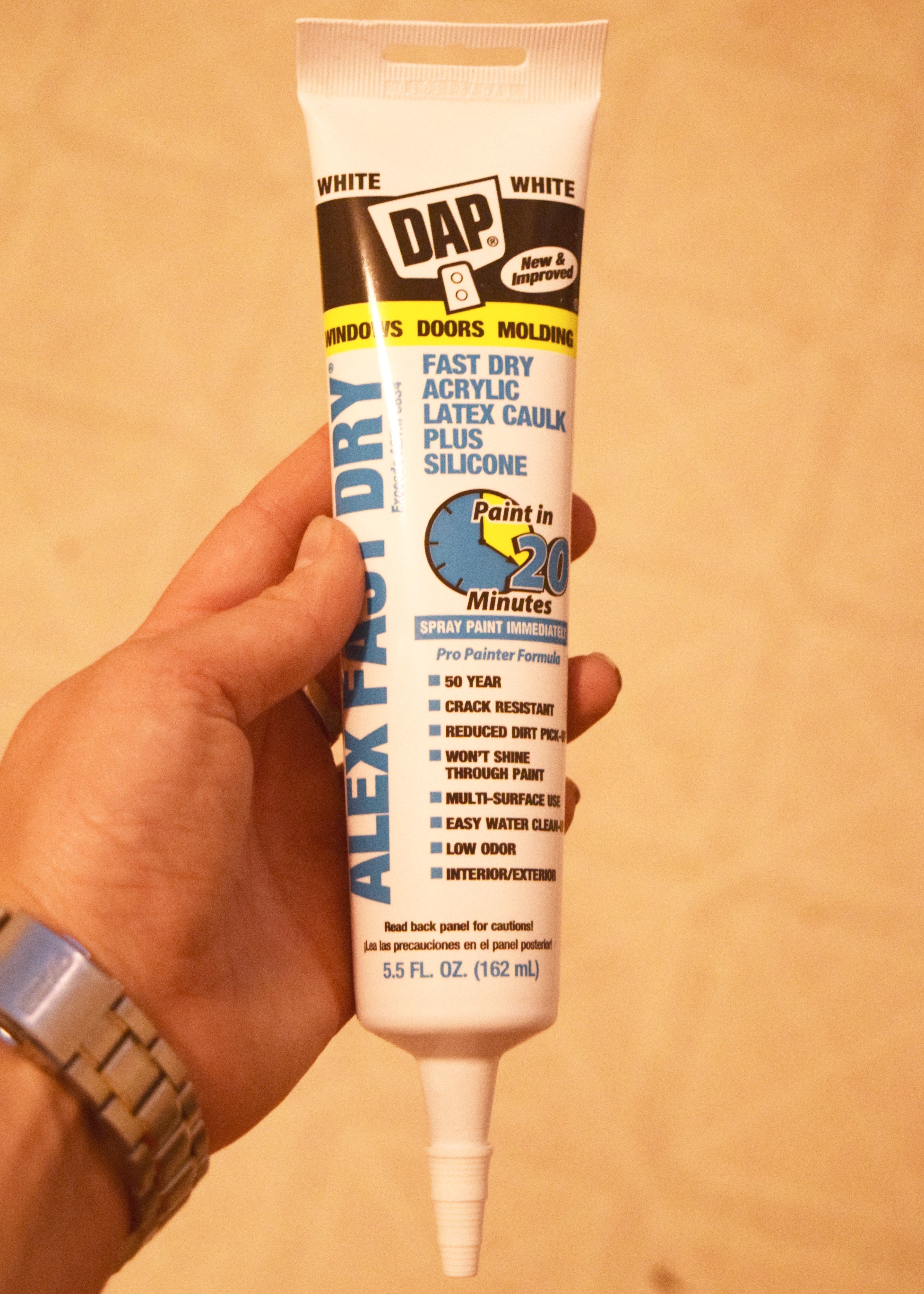
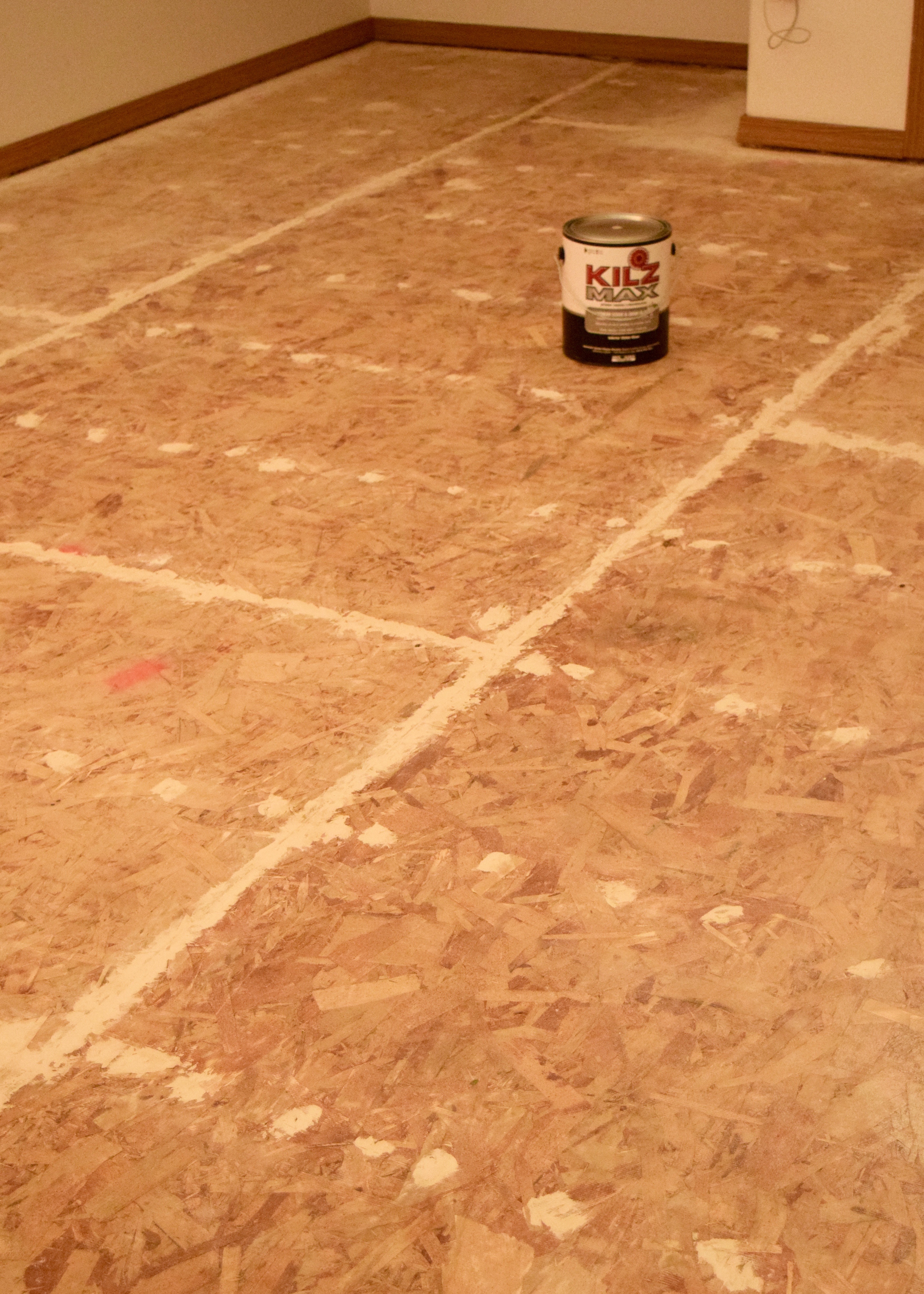
10:30am begin filling screw holes, saw cuts, and spaces between particle board panels, day dream about how much easier than paint prep, painting will be

Wood Filler | Land of Laurel

1:00pm – eat quick lunch of something you just pop into the oven from Trader Joes

2:00pm – hop into car

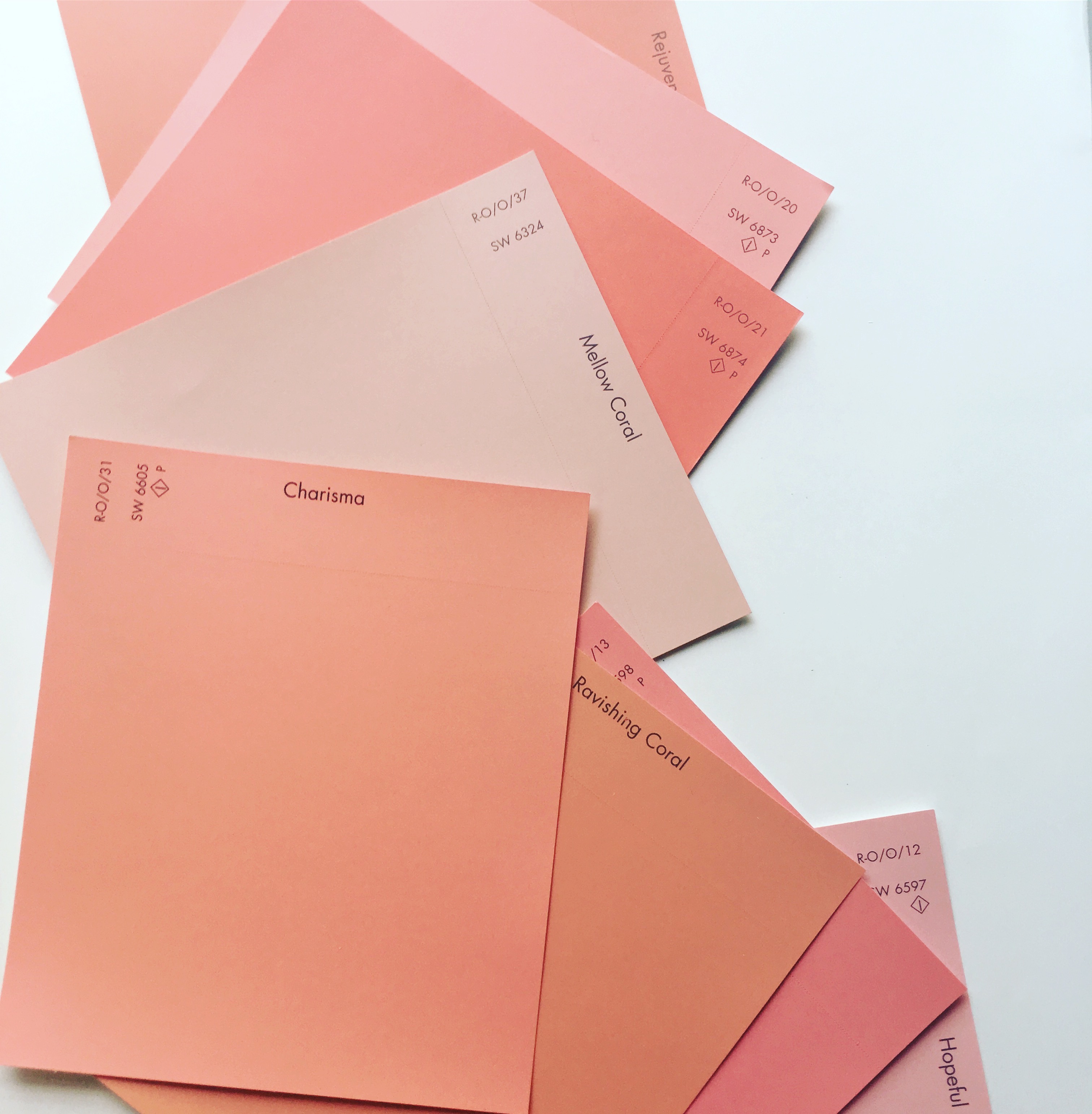
2:30pm – buy Benjamin Moore Natura Semi-Gloss paint in Waynesboro Taupe at Powell’s Paint. Color selected quickly as the swatch  isn’t yellow-brown, but doesn’t clash with the trim and is light enough to help reflect light around this dark windowless room

3:00pm – arrive at Environmentally Conscious Recycling and weigh van

3:30pm – finish unloading car at ECR, weigh car again, pay minimum $25 fee

3:45pm – stop by Home Depot again for more wood filler and wood transition strips

4:00pm – fill remaining holes and cut marks

5:00pm – hop into shower

6:00pm – wash ibuprofen down with wine (not recommended) at Nikki’s, eat authentic homemade Japanese curry, try not to fall asleep on her sofa

10:00pm – fall into bed, more sore than before

Sunday

7:30am – alarm goes off, groan in pain, take more ibuprofen

8:00am – finish breakfast and get dressed in work clothes

8:15am – beginning cutting in Kilz Max Stain and Odor Blocker water based primer (highly recommend! Not too smelly – though I wore a mask – and had excellent coverage)

11:30am – finish cutting in primer, begin rolling primer

12:30pm – finish rolling in primer, eat lunch, take break while primer dries, realize I’ve missed tons of screw holes/cuts that will need to be filled

2:00pm – start second coat of primer in certain areas (like those that now have exposed wood filler)

3:00pm – wash brush and roller, eat snack, take break

6:30pm – install wood transition strips at entries to bedrooms and bathroom

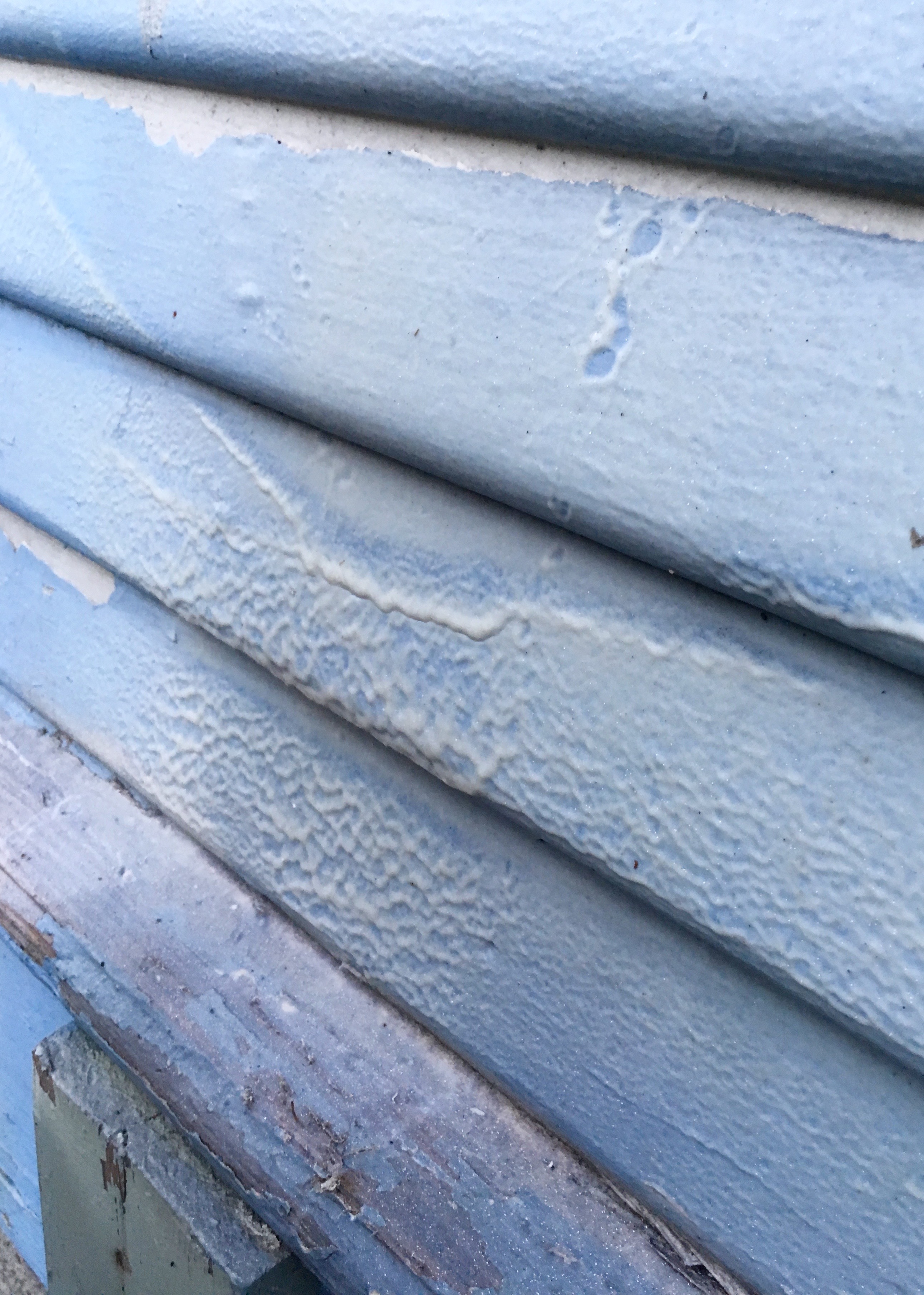
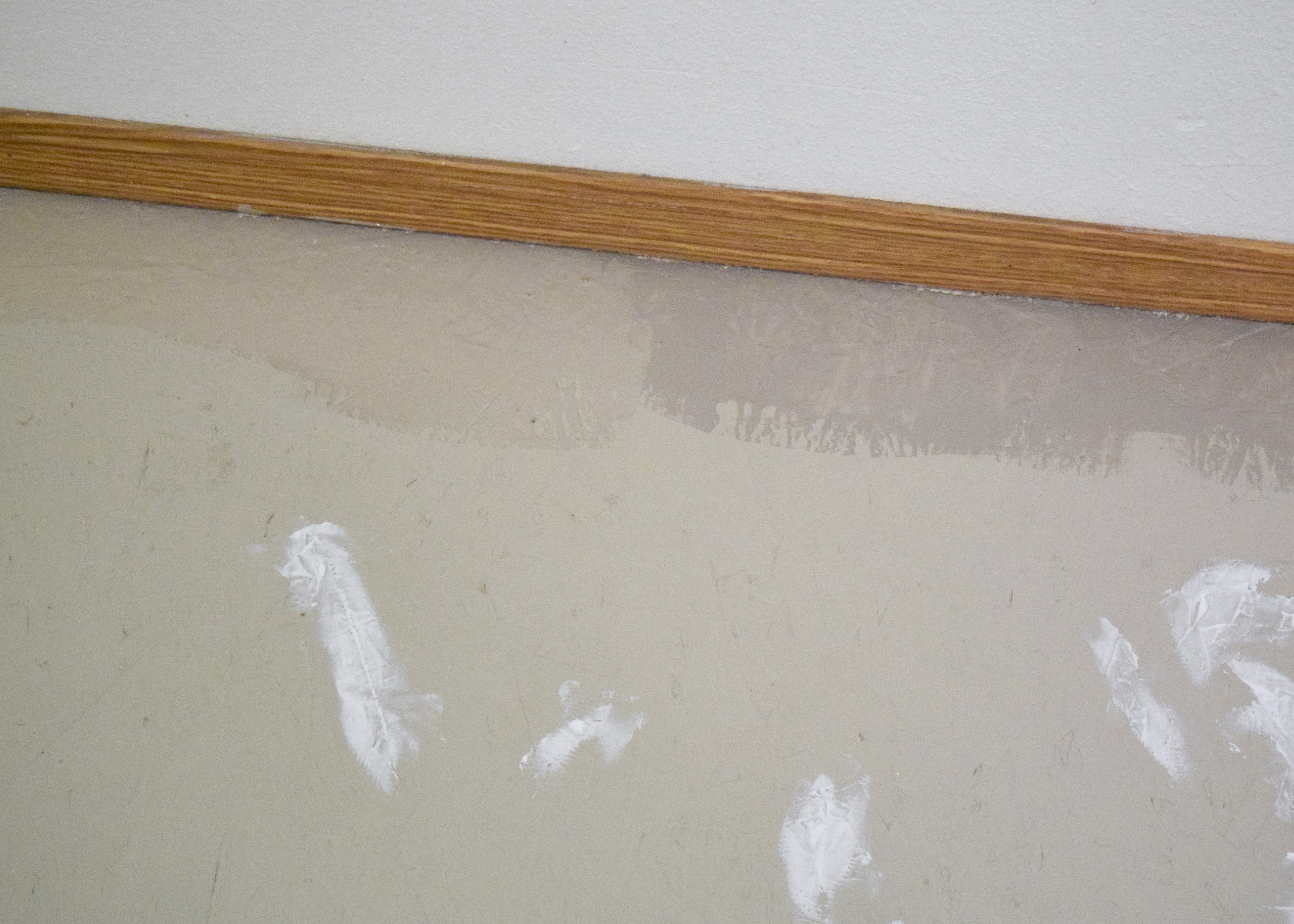
7:00pm – start cutting in paint, realize wet paint is nearly the exact same color as dry primer and it is basically impossible to tell where you’ve painted or just primed, discover the paint (luckily) dries much darker. Primer is the main field color below with cut in dry paint on the right and cut in wet paint on the left!

Primer vs Paint | Land of Laurel

10:00pm – finish cutting in paint, start rolling

Cut in Paint | Land of Laurel

11:00pm – finish rolling, eat dinner,  shower


Painted Particle Board Subfloor | Land of Laurel

11:30pm – fall into bed more tired than ever, dreading work the next morning.

Whew! I’m exhausted just remembering all this! Yup, that was my weekend. My exhausting, back breaking, someone please feed me, weekend. And I am 100% glad I did it and 100% not willing to do it again any time soon. Especially since the next weekend I went back in, touched up a few spots I missed with paint (got to love Benjamin Moore paints that only required 1 coat!), and then sealed the floors with Safecoat Acrylic. I let that dry for another week before bringing the furniture back in.

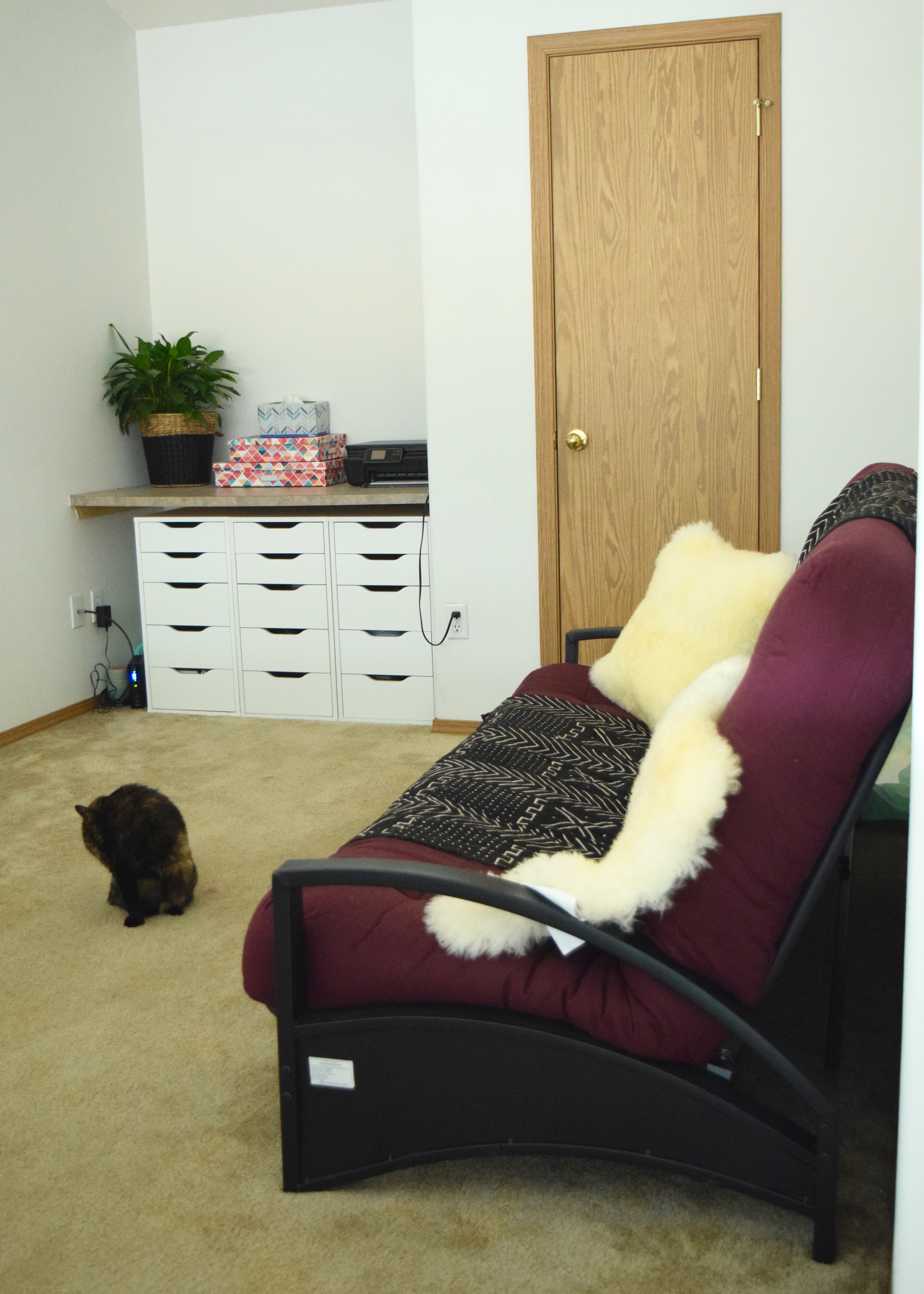
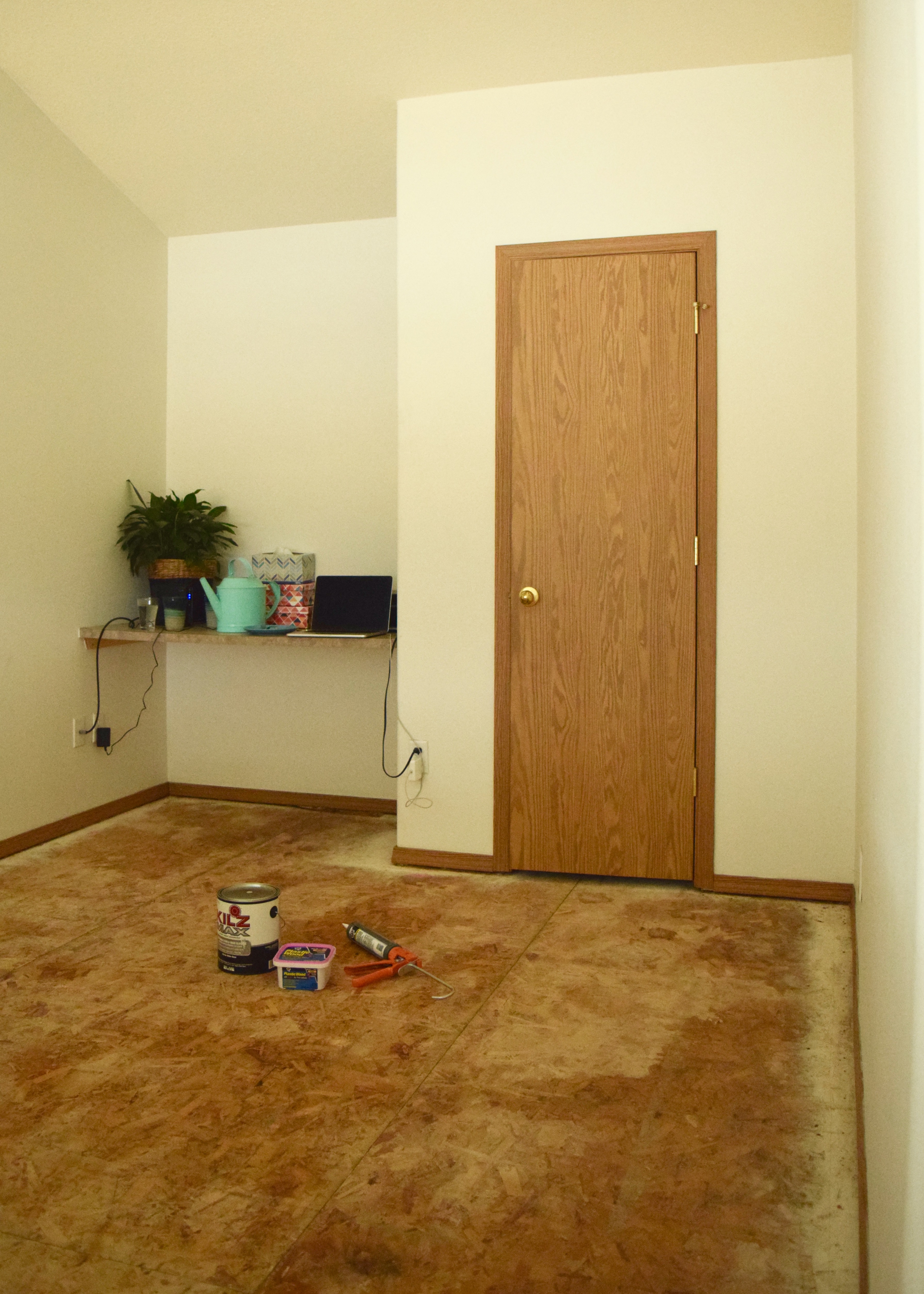
We still have the futon in here for guests and all of the electronics on the built-in counter I want to drill a few holes and add some grommets to tame that mess. I did buy a nice big West Elm rug which I’m hoping will cozy up the space!

Furniture in the Bonus Room | Land of Laurel

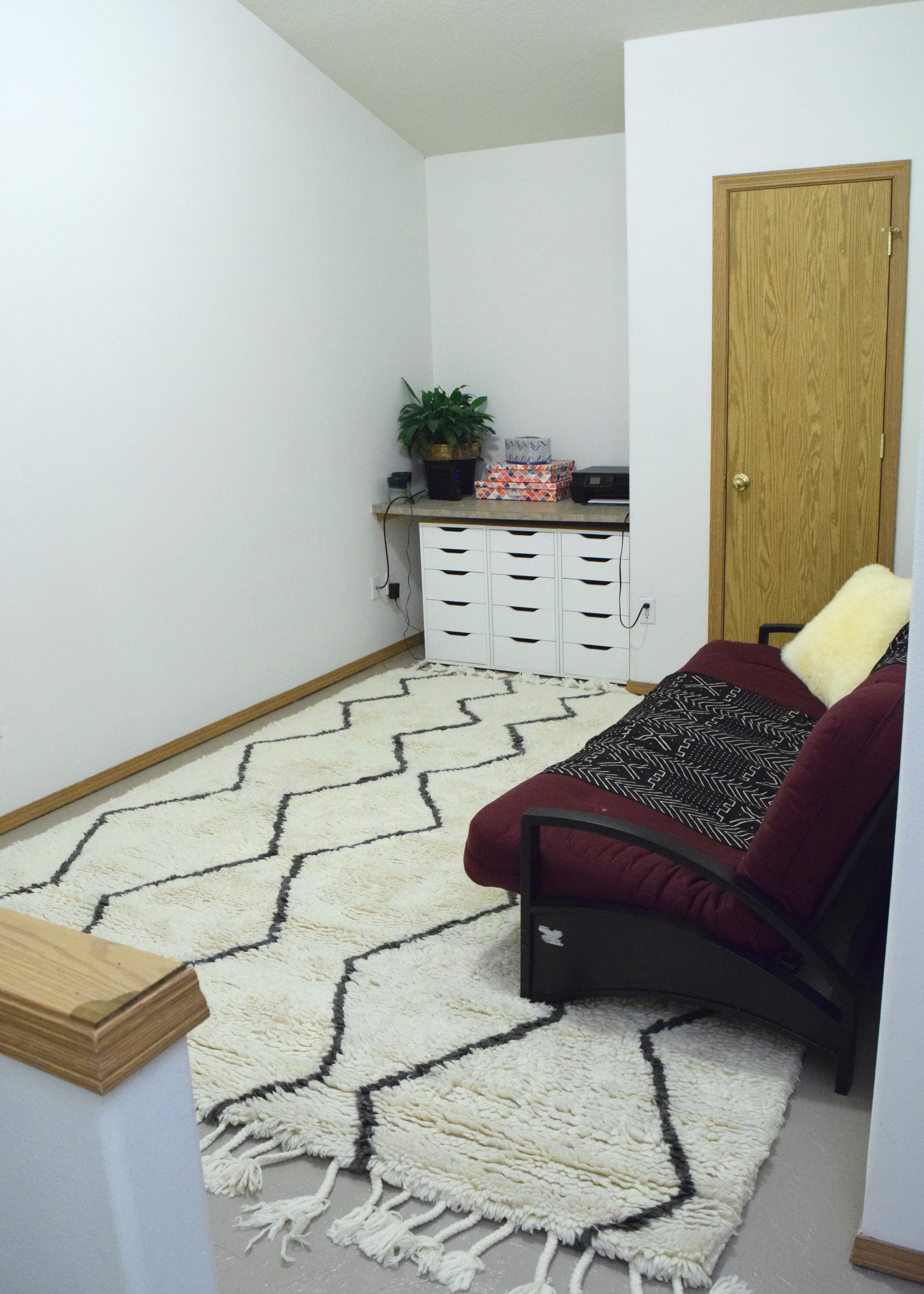
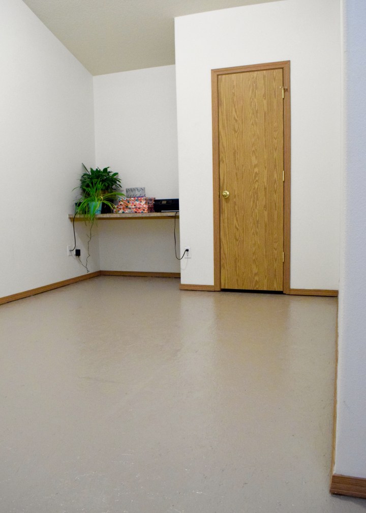
You can see here how the window in the stairwell sits low, below the half-wall railing in the bonus room, preventing much light from illuminating this room. Even in the middle of the afternoon, this room is pretty dim. A light colored paint on the floor was a must for brightening up the space!

Bonus Room | Land of Laurel

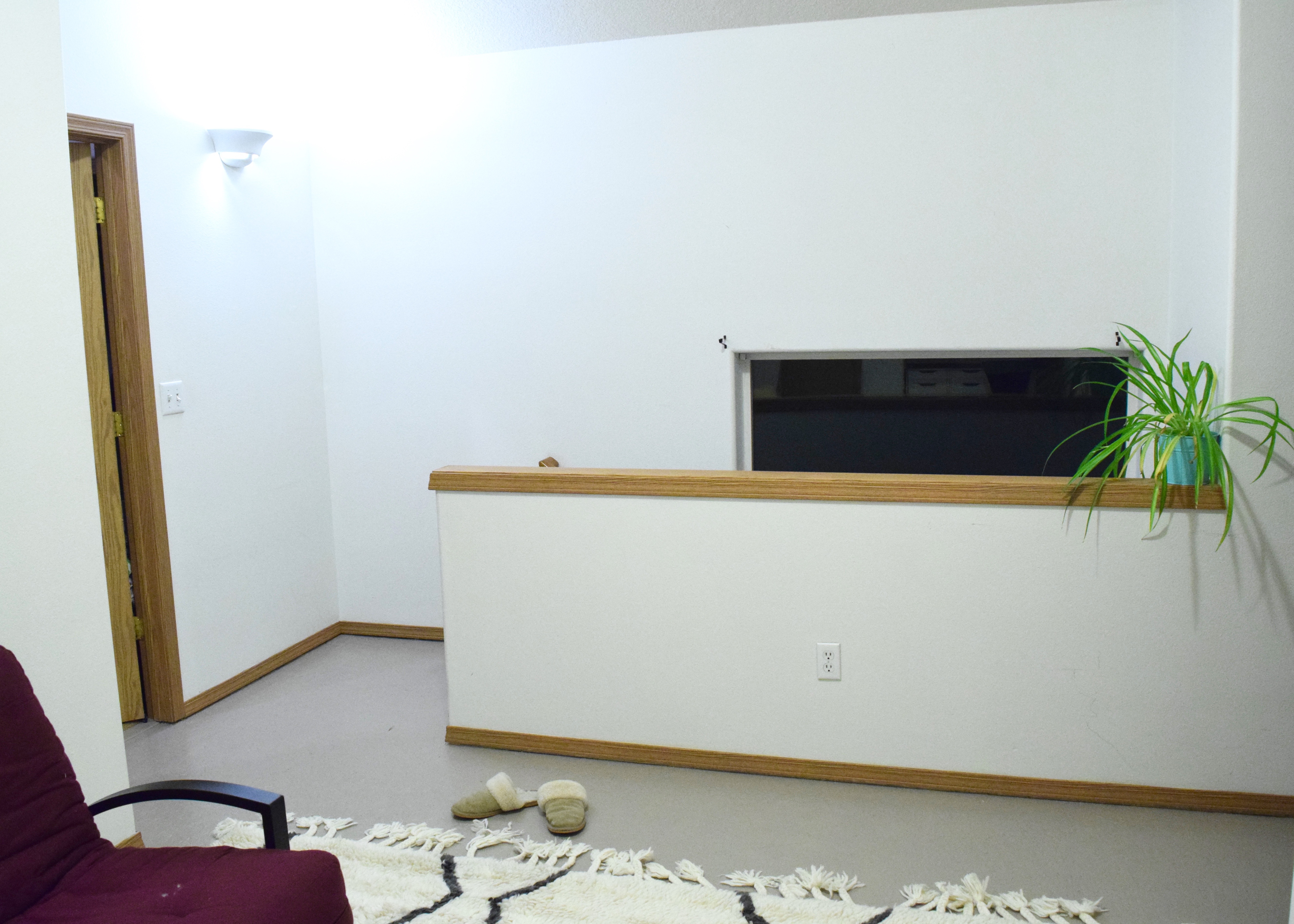
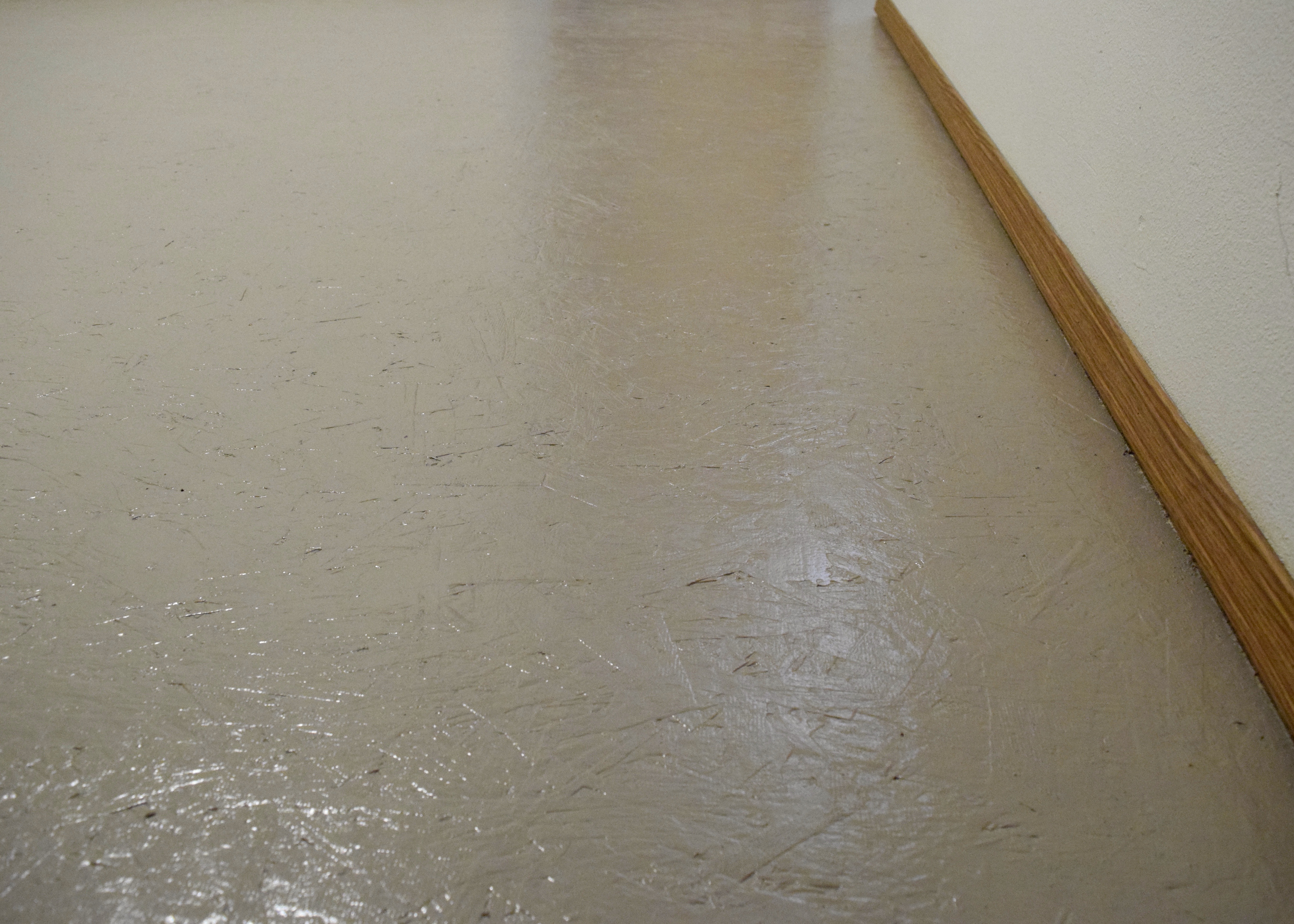
Our yellow brown trim will always stand out pretty starkly, but that’s the nature of it. If the room was brighter, I would have painted the floors a nice deep black. The trim would still have popped against the black, but the room would have been dark dark dark! In person the color is the perfect blah tone that fades away on the floor, letting everything else speak for itself. I don’t mean that in a bad way at all! It’s a nice safe background. This picture below shows it very close to how it looks in person.

Painted Particle Board Subfloor | Land of Laurel

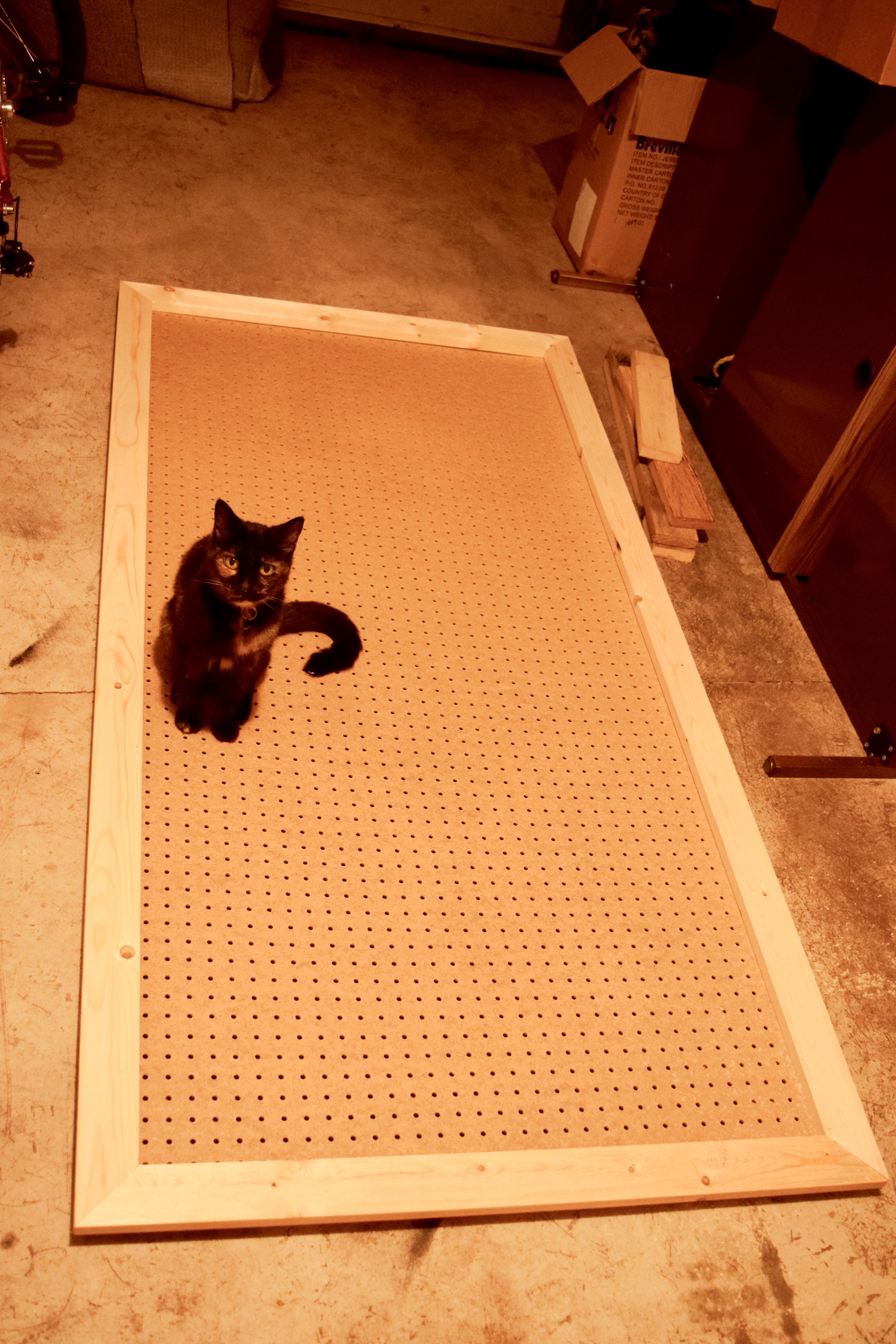
And this post wouldn’t be complete without a kitten photobombing, so here we go, model pose!

dsc_0405

How much did it all cost?

Supplies and a Gallon of Primer cost about $60

Benjamin Moore Natura Paint Gallon also $60

Recycling Fee for the carpet $25

Safecoat Acrylic Sealer $95

Which left me spending about $240 which my landlord happily reimbursed me for. Although the labor was quite demanding, I’m pleased with the result and couldn’t be happier for the change! It’s mush nicer walking on the painted and sealed subfloor. I don’t miss that gross carpet one bit!

Have you ever painted subfloor? How has it held up for you over time? Although painting didn’t take long, I was a bit shocked at the number of staples that needed to be pulled up. My hand had the imprint of the pliers for a week afterwards!


Hanging in there!

Hanging in there!

Woah. Did you guys watch the Walking Dead last Sunday? Because, I need to talk to somebody about that punch-you-in-the-face, heart- wrenching, knock-you-dead season premiere! So violent. So psychotic. So depressing. Wowza! Let me know your thoughts. I need to talk about it with somebody or I’ll go crazy.

In other news, I am no longer living with all my pots and pans sitting on the counter! Nice segue, right? Remember when I filled up my china hutch-turned-pantry and started pulling this kitchen together? I shared this shot:

China Cabinet Pantry | Land of Laurel

Well, take a look at this and see if you can spot the difference:

China Hutch Pantry and Pegboard | Land of Laurel

No the dead plant is still the same dead plant (really need to get my s*** together and share a shot of the lovely new snake plant which now lives in that pot!). And no the random lamp on the floor isn’t anything new (you should remember that lamp from long ago). It’s the pegboard over in the kitchen! That’s right! Vertical storage wins again!

Now rather than moving 15 million pots and pans around every time I need to use the counter space, I can actually use the counter space! It’s the little things, people! The back wall of our kitchen was so under utilized before. A big blank wall with nothing but some mismatched trash/recycling receptacles was not an ideal situation in a kitchen lacking storage.

Kitchen Before | Land of Laurel

There just is no reason for this wall to have so little purpose. And no reason for all those pots to sit on the counter. Now? Much better.

Kitchen Pegboard | Land of Laurel

Matching trash and recycling containers from IKEA (I spray painted the recycling bin green) plus a pegboard adds up to a much nicer view. Most of the pots and pans are my roommate’s, but the center column holds my cast iron pans and the one pot I’ve had since college. My Staub dutch oven and pie pans live in the china hutch. Having all the pots and pans within such easy reach is absolutely wonderful. I just reach over any time I need any thing, I much prefer it to digging through the lower cabinets. Putting together the pegboard was super easy. Anyone can do it as long as you have the right tools.

I picked up the actual pegboard at Home Depot and had them cut down the 4’x8′ size to the dimension I wanted: 3′ x 6′. They offer this service free, so take them up on it if you don’t have the correct cutting tools. While I was there I grabbed a couple of 8′ long 1x2s to pop the board off the wall (allowing the hangers to slip in) and some 1x3s to trim the board out.

At home, two quick cuts later and I had the boards ready for the back of pegboard. Excuse the dark garage photos. There are worse pictures yet to come. Cutting the 8 foot boards down to just under 6′ allowed me to have boards along the lengths of the pegboard and the top and bottom. They didn’t need to be perfect since they were purely for function and wouldn’t be visible. I screwed them in from the back so they were completely invisible (like ninjas) from the front.

Pegboard | Land of Laurel

The trim pieces were almost as simple: set saw to 45 degree angle and cut.  But of course I started right off with a mistake. Luckily I was able to reuse the board for the top and bottom trim pieces and didn’t waste much.

Cutting Error | Land of Laurel

Once I turned my brain on, I quickly made the rest of the cuts. Each length was an inch longer than my pegboard so the trim would stick out from it on all sides. I then screwed all of these boards into the pegboard and things started taking shape. It looked so good, Malary decided to pose with the pegboard. It’s so nice to have such a supportive pet.

Pegboard | Land of Laurel

Since edges never match up entirely perfectly, I filled the mitered corners with wood filler and gave the same treatment to the more prominent knots.

Pegboard | Land of Laurel

Then I did some minor sanding (I get super lazy about sanding, but it’s a requirement so I tried to tough it out). After that, I filled the gaps where the trim meets the pegboard with some paintable caulk wiping up the excess with a wet finger. I like this little container because it stays good for a long time, rather than drying out immediately like the caulk guns.

Caulk | Land of Laurel

Once everything was caulked the board was functional, it just needed a coat of paint to spruce things up!

Pegboard | Land of Laurel

Two coats of primer later, it was ready for some paint.

Pegboard | Land of Laurel

I chose Benjamin Moore’s Palladian Blue (HC-144) in their Natura line (zero-VOC) for the board. It’s a really light aqua tone that is subtle, but still stands out from white. It has quite a bit of grey in in and the swatch seems to be almost white, but once it’s up on the wall, BOOM! COLOR! Plus, I love Julia Child and she had teal-blue pegboards all over her kitchen, so I’m in good company! After two coats of paint, I did three coats of Safecoat Acrylic sealer in high-gloss. I wanted the board to be extra protected from water and oils. Once that was all done, it was time to bring it inside.

Pegboard | Land of Laurel

I hung the board on the wall with a few heavy duty D-rings hooked on hangers screwed into wall studs and it is fairly sturdy. I picked up this pegboard hardware kit at Home Depot too, which was way more than enough to hang the pots and pans. I have enough left over I might take the pegboard scraps and make another for the garage!

Pegboard | Land of Laurel

Covered in pots, it really does make things look happy, colorful, and organized. I’m ready to sauté those carrots at a moments notice now.

Pegboard | Land of Laurel

Having our counters back and free for their original purpose (prep space) is delightful. Not looking at a pile of pots and pans every time I walk into the kitchen is pretty great too! The trash and recycling containers are just the right size for us too. I love the matching size and though not everyone would like the different colored recycling, it’s nice to easily be able to identify it as “the green one” when people come over.

Pegboard | Land of Laurel

Plus I get to lovingly stare at my cast iron pans now. Definite bonus.

Pegboard | Land of Laurel

I love those pans… though I wouldn’t mind upgrading them to Lodge pans down the line. I’ve got these guys seasoned just perfectly now with just over a year of use. Cast iron is my favorite!

So if you have a blank wall – put it to use! Don’t fuss around with birds, put a pegboard on it! (I’m so Portland now).

Have you guys ever come up with creative storage solutions in your rental kitchens? I’d love some good ideas!


The Moment We’ve All Been Waiting For…

I found new nightstands! Finally. Yup, that took a while. Before I jump into the new, let’s go over this again. You might remember my old nightstands? They were about 16 inches too tall for my bed and belonged to my parents. I’d promised them I would eventually return the side tables and when they bought a new bed for their guest room, I knew it was time. Their new bed is the perfect height for these tall, dark, and handsome guys.


Left Nightstand | Land of Laurel


I’d been checking craigslist, yard sales, and estate sales for about 8 months now, searching for anything that I could substitute these guys for. I needed something about 20″ – 26″ high and no more than 24″ wide. The width was a major issue, as I truly only have 25″ on either side of my bed. Any nightstand wider than that simply wouldn’t fit in the room. The deeper, the nightstand, the better, as I am lacking in storage. I hoped for something with lots of drawers I could fill up. My love of symmetry demanded there be two identical ones. After months of looking, I finally landed on this somewhat promising looking ad:


Craigslist Nightstand Ad | Land of Laurel


The nightstands looked functional and the drawer was much needed, plus there were two of them and the price was decent. I didn’t love the color, but I figured I could always paint them green or white or blue. The fact that they only had one drawer, deterred me slightly, but I had yet to find anything else that would come close to fitting in my space. Plus, I could always stick a basket there and fill that up. I figured I might as well give it a try. I emailed the seller to see if he’d take $50 for both of them. He agreed to the price and I met him the next day with cash. When I took a look at the nightstands in person, I was disappointed. His measurements from the ad were completely wrong. The nightstands are 20 inches wide, 14″ deep, and 24.5″ high. It may seem like only a slight difference, but when you’re lacking storage and need incredibly functional nightstands, every inch counts! My plan to paint them would still work, however, the wood finish was in such good shape, I was hesitant to even do that!


I turned to the seller and told him that the nightstands were a lot smaller than what I was anticipating and I didn’t want them. He was surprised, but he really wanted to get rid of them. He offered me $40 for both. Now, a normal person would simply have walked away. They didn’t really fit my needs, right? I am not a normal person. This was such a deal! Two solid wood, matching nightstands in great shape with dovetail joints? This isn’t an everyday find. Maybe I’d learn to love them. At $20 each, they were significantly less expensive than anything else I’d see. Most people on craigslist were asking for $200 per nightstand. Way out of my budget. So what did I do?


I handed over two twenties and left with the nightstands of course.


I have no will power. None. At all. Whatsoever. Just ask that bar of chocolate in my kitchen… Oh wait. You can’t. I already ate it!


I brought the nightstands home and wiped them down with Honest Multi-Purpose spray. Once they were clean, I moved them into my room. I didn’t want to buy baskets for them just yet, so I filled the bottoms with what I had lots of: books. They looked… okay. Sigh. Not exactly the magical moment I was hoping for…


New Nightstands with Books | Land of Laurel


Even if that photo had been taken when the weather was sunny and the lighting cooperative, they general idea wouldn’t change much. The new nightstands just didn’t look right in the space. Dang! The books certainly were not helping. The color of the nightstands contrasted both from the red tone of the fir woodwork in the house and the espresso finish on my headboard. This was not good.


I tried one more time to make things look a bit better and filled the nightstands with blue and green books in tones similar to that in my bedding. This helped things, but honestly, the nightstands were still not doing it for me. Sure, the book storage was great and I could even slip my laptop in there among them, but I lost tons of storage overall and this just didn’t look great.


Nightstands with Blue Books | Land of Laurel


I was somewhat surprised that I had enough books in these color tones to fill the other nightstand. I have a lot of books. Possibly too many, but whatever, I love them. And I re-read them! Also does anyone else see a monster peeking up out of the floor in the shadow outline of the bottom of the nightstands in between the feet? Just the top of his head, two little ears sticking out?Just what I need, right? A monster hiding in my bedroom. As if I don’t already have enough stress dreams!


Nightstand with Green Books | Land of Laurel


Still this look… wasn’t working for me. I thought, maybe if I lived with them I’d learn to love them. So one month later here I am. What have I decided? Nothing. What have I created? A Pro/Con List.


New Nightstand Pros

  • They’re the right height for the bed, making turning on or off the light at night easy
  • They are wide enough to fit the space by the bed, but skinny enough to not overwhelm the space or make it look stuffed in
  • I can store books here!
  • I can paint them green or white
  • I have a great excuse to buy cute new pulls at Athropologie or the Alameda Flea Market


New Nightstand Cons

  • The wood tone is awful, but the finish is in such good shape, I’d feel guilty painting them
  • There is not enough storage
  • The drawer is too shallow to fit some of the taller things I’d like to store in it (like vitamins!)
  • I could fit wider nightstands for more storage
  • I don’t particularly like the curvy look


Conclusions? These nightstands work in some ways, but not others. If I didn’t need more storage they would be okay. I don’t love the look, so why keep them? I’ve already started looking for new ones on craigslist. I also have high hopes for a nice sunny spring day hitting up some Santa Cruz yard sales too. My Aunt Pat is the queen of Santa Cruz yard sales and we could make a fun day of it. If only it would stop raining!


Yay for mistakes! Someone told me once to be proud of your failures, because how else do you learn? In fact, she told me to yell it out. So, here it goes. I FAILED!! These nightstands were the wrong choice.


Moving on. What have I learned? Sometimes, you should just wait it out until you find something truly perfect for your space. Once I find new nightstands, I’ll sell these guys on craigslist and hopefully make a small profit. Someone else out there must be looking for matching nightstands right? Fingers crossed! It certainly has been a rough design rollercoaster in 2016. I’ll share some other not so great things I’ve bought recently later this week. Oops!

Going for the gold!

Sorry for the long absence! I got the cold of death right before Thanksgiving and barely survived! Or at least that how it felt… The cold is mostly gone though I’m still fighting off a nasty post-nasal drip. Aren’t you glad I told you? I ended up taking a few days off work and lying in bed all day and as much as I wanted to be productive here on the blog, watching re-runs of Grey’s Anatomy on Netflix was pretty much all I was capable of! And then it was Thanksgiving! My goodness how fast November went by! December should be a good month though. I have some fun things planned and have been getting crafty with my family! Get ready for colorful garlands and festive Christmas trees! Until then, let’s get back to my bathroom.


So when I first moved into this house there were a few things I immediately bought: sheets, towels, contact solution, a shower curtain. You know, the essentials. Standing in the aisle at Target that night there weren’t many options. And it was 9:30pm. And I’d spent the entire day moving boxes of books into the house and putting furniture pieces back together with nuts and bolts. I was exhausted. I grabbed the first shower curtain that looked decent to me. It was white and yellow and had a bold chevron pattern. Yellow would look good, I thought, the walls are yellow after all, and the countertop is yellow, and mustard-y yellow looks good with burgundy red. You remember my shower curtain right?


DSC_0241

Well, it’s not mustard. Or yellow. When I got home I realized that the florescent lights of Target in Emeryville had hidden a key item. The metallic sheen. My shower curtain was gold. I was upset for all of five seconds before I realized I’d made a fantastic mistake! You know the saying “There are no mistakes, only changes in plan”? It’s dead on the nose correct. My plan changed and the space is better for it.


Gold. That was what I decided. Gold accents in the bathroom. Sure, the door knobs are oil rubbed bronze and the bathroom fixtures are chrome. Whatever. Metallics are in. And this is the season of gold. Suddenly gold is everywhere! Aged brass, brushed bronze, unlaquered brass, call it what you will. The 80’s fave is trending again. Bring on the gold! Look at a design magazine, they’re starting to pop up more and more. People are embracing gold! Gold is warm! Gold is friendly! Gold is new(?)! Or at least new again… Ha!


I embraced my happy accident. I decided to go for it. And no, I’m not changing out my beautiful fixtures or painting them or anything crazy that will prevent me from getting my security deposit back. I am going for mixed metals and giving gold a big ol’ welcoming hug complete with back rubs and a gentle squeeze. Heelllloooo gold!


First things first, that black plant stand? Going for the gold! The plant stand is the perfect place for stashing my watch or my hair ties when I shower or my book when I’m getting into the bath. It’s super convenient and I love it. Err… Correction: I love the functionality of it. The actual stand itself? Hideous! I got it for free from work when we cleared out the warehouse last summer. It’s chipped and rough and not fantastic in anyway. Guess what? I changed that. I switched things up! I went for the gold! Here’s how it was looking the other day when I pulled the plant off the stand and carried the stand outside.


Land of Laurel


After looking at it’s sad, sad state, I gave the entire thing a good sanding with some rough grit sand paper. I wanted to be very careful to get off anything looking rusty and anything that looked like chipping paint. I spent quite a bit of time sanding this actually. I wanted to be sure that the gold with stick! After a good while it was looking more like this and ready for some paint.


Plant stand sanded | Land of Laurel


Once it was sanded I was especially careful to wipe the entire thing down and dust off the area it was standing in. I wanted to be sure there wasn’t a single spec of sanding dust on that stand. Spray paint is durable, but it needs to be properly applied. In a wet environment like my bathroom? Worth the extra effort to get this right. Dampness can definitely affect a coat of paint. Once I was sure the stand was good and clean, I took out my primer and went to town!Plant Stand Primed | Land of Laurel


Primer does wonders for holding on to a coat of paint, so I gave the stand a few coats. Unfortunately, painting something as thin as this is a bit wasteful. The stream of paint goes on wider than the tiny bars of steel. I needed a second coat for sure. Plus, after the first coat I looked it over and realized I’d forgotten to paint entire sides of the bars. You guys, there are so many sides on this stand! I was sitting and crouching and peering over the top at it trying to get a coat of paint on every surface! So. Many. Surfaces. No wonder geometry is so difficult!


Once I was done with the primer, I moved on to paint. Guess what color? Just kidding, you already know I went for the gold! This Rust-Oleum color is such a nice gold. It’s not too yellow-gold if you know what I mean. It’s a tad more neutral and has just the right amount of metallic sheen. It’s a very modern take on gold. I luuurve it!


Gold Paint | Land of Laurel


Ooops, there’s a surprise project hiding in the back of that photo too. It snuck it! Promise I’ll share the deets soon.


Anyways, the gold looked good! But boy did I use a lot of paint. SO. MANY. SURFACES. Did I mention that??


Plant Stand Gold! | Land of Laurel


And that’s just after the first coat! See how it’s a bit patchy in places? I needed to work to get good coverage on all. those. surfaces! So many sides, people! So many!!


I love the stand in gold! It just gleams! It’s like a gold medal platform for my plant. Just perfect. It’s great for stashing last minute items before I hop into the shower or for keeping things dry, but in reach when I take a bath. It’s pretty convenient. And now it looks great too! I stuck rubber furniture pads on the bottom of it to lift it slightly off the floor in case things get a little wet. Better safe than sorry! Hopefully that helps keep the paint looking fresh down the line!


Plant Stand Gone Gold | Land of Laurel


I turn the stand at an angle in the bathroom — following the curve of the bathtub actually — so the shower curtain slides behind it more easily.A simple, quick fix, but it feels so much nicer! I popped that plant on top and stuck my watering can beneath it. I stick the watering can in the shower when the water is getting hot, so I like to keep it close by. This seems to be the perfect spot! Plus Malary likes to sip out of it. Gotta stay hydrated right?

The stand is a bit more of a neutral gold than the slightly more yellow-y shower curtain gold, but they work fine together in my opinion and I prefer the more neutral color.

I’m slowing checking off the boxes of the to-do list in here. Closing in on having this space almost complete! Just need a bit more time. I’m excited to have one room done, done, done!

Color Pop, Pow!

You may have heard that Rust-Oluem is donating $10 to Bright Pink for every project with the tag #paintitpink for Breast Cancer awareness this month! Bright Pink is an organization that aims to save women from Breast and Ovarian cancer. Breast Cancer is close to my heart since one of my namesakes has battled it in the recent past.  Since I’m always up for a spray paint project I jumped on this challenge!

Print
– via –

Now, I wouldn’t say pink is one of my go-to colors. I wear it infrequently and don’t really want a lot of pink in my home. However, pink can be one of those awesome bright, happy colors that creates an awesome pop! when used well in a space. I decided I wanted just that kind of pop. During a recent IKEA trip I picked up some of their pots. (I seriously cannot leave IKEA without a few of these in one size or another, I have a problem! #addicted!) I wanted to put a few on top of my toilet to add some greenery to the bathroom and I wanted some for the kitchen windowsill above the sink for succulents. I love plants, they make me feel so happy an alive. When you add them to a room, it really brings a space together! Plus, they take in CO2, put off oxygen, and promote better indoor air quality! I grabbed this planter pot for the Paint it Pink challenge while I was at IKEA, I figured it would look good as a color pop! on a shelf.

Paint it Pink Pop

Because I am addicted though, I also bought eight of the smallest version of these pots too. For another project. That I decided to start simultaneously. Call me crazy and you’s be right! The next time I was at Home Depot (okay, okay, it was the same day, because I’m always there!), I picked up Rust-Oleum’s Berry Pink spray paint in Gloss.

Rustoluem Berry Pink

Then it was actually time to get painting!! I set out all my pots on my canvas tarp, put on my elaborate painting mask, and got to work!

Spray Painting All the Pots

Five minutes of work and two quick coats later and my pot was bright pink! Such a happy color!

Paint It Pink Pot

I popped in this bright pink plant, I thought the pink of the plant tied into the pink of the pot quite well! And look how the pinks brought out that awesome stripe-y green leaf! How amazing in nature? SO AMAZING!

Paint it Pink Plant

I love the way this looks! It is such a great pop! of color. It’s more than a pop! It’s like a straight POW! to the face!

Paint it Pink Plant Pot

And just like that the #paintitpink challenge was complete with my Paint it Pink Plant Pot! Sorry, I just couldn’t resist all the ‘p’s! Wait, now, I’m thinking of a different bad joke about ‘p’ with a few ‘e’s tacked on at the end… Okay, I’ll stop with the jokes while I’m ahead! (At least give me points for that? Oh you didn’t realize there were points?! Life’s a competition good sir!) Yup, okay, now I’ll remove the foot from my mouth. 🙂

Did you participate in the Paint it Pink Challenge?? What was your project? I thought Katie Bower’s growth chart for her niece was just too cute!!