Oh my goodnesss! My brain is doing cartwheels, you guys. There is SO MUCH to do and SO MANY things to plan. It’s hectic and insane and oh so much fun. So what’s going on at the moment? Just a few things:
- A new roof is going on and so is a dormer!
- The exterior of the house is being prepped for painting.
- We’re redoing the kitchen floors… slowly, but surely!
- I’m designing the bathroom and getting ready for demo.
- The garden is being worked on, weeded, and seeded with clover!
- Electricians are scheduled and I’m selecting new light fixtures where needed.
Whew! I’m exhausted just recounting this. Each of these things has taken a whole bunch of time and planning, thinking and rethinking. I’m just a tad stressed and just a tad tired and just a tad sore, but most importantly I’m happy. The major stress lately, however, has been getting the exterior of the house in shape as soon as I can. Because winter is coming. And although Portland winters are not nearly as bad or as long as those in Westeros, you may have heard the rumor that it rains here.
Well, the rumors are true my friends, it rains here in Portland! Which means the roof issue needed to be addressed first. I spent weeks thinking up a plan and drawing up construction documents in CAD. Luckily the City of Portland has a Homeowner’s Permit Night where you can bring drawings to review with their structural engineers for tips and information as well as get permits during non-business hours. I spent two consecutive Thursdays in those offices the first talking with a structural engineer about how to best support the dormer and the second evening actually getting the permit. In between those two Thursdays I spent many, many hours working in CAD to get my drawings ready for approval. It was a huge relief when they passed and I was able to get my permit! The most frustrating part of the process was the long hours on the computer when I really wanted to be at Berrybrier sledge hammering something.
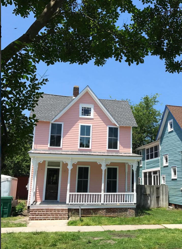
After my drawings were done and the permit procured, I had to select a roof color so the roofers could begin, but how to select a color for the roof without selecting a color for the house? Well, let’s go back to the pictures of Berrybrier. It’s a bit difficult to see in pictures, but the windows of the house are dark green. On the plus side, a previous owner updated all the windows to double-paned, vinyl-exterior, wood-interior windows which is *almost* what I would have selected myself. If it was me, I’d have selected wood interior and exterior windows. But, alas, what’s done is done and I don’t have to do it! The decision for dark green, vinyl-exterior windows though is a pretty permanent one. As these windows can not be painted, I had to pick a paint color for the siding that would coordinate with dark green.

What goes well with dark green windows? White? Hmm… an all white home with green windows would be classic. White siding paired with white trim is also very popular right now. I found this inspiration photo which shows a house with white trim and siding, the windows are dark brown here, but you can easily imagine them as green. You can barely see the roof here, but it looks to be a dark charcoal.
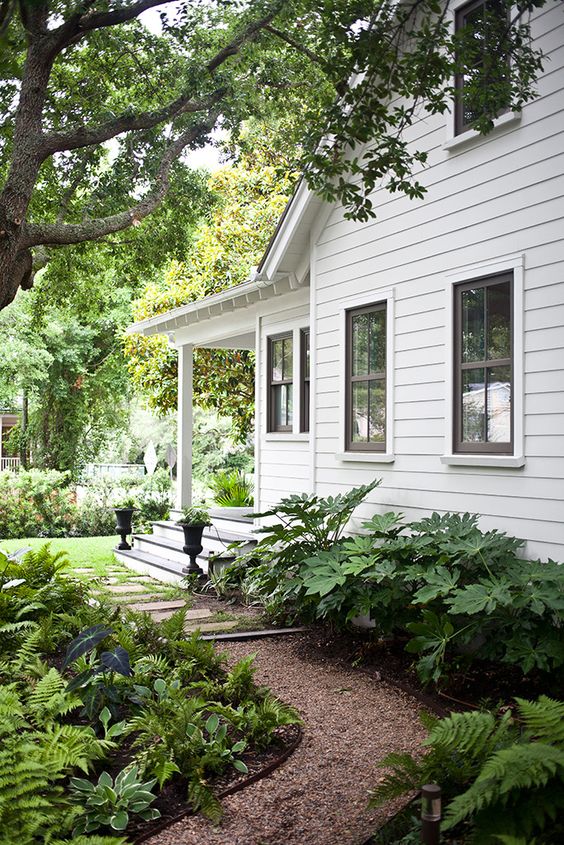
As classic and lovely as this is, it is very popular. Would I recommend it to a client? Absolutely. But, for myself, I wanted something a bit more exciting. I wanted something happy. A house that makes you smile just walking by it. What is colorful and happy that goes well with green? Coral! And coral is another name for salmon and salmonberries are delicious and the house is already called Berrybrier, so really, could there be anything more perfect? (Did you see how my brain works there?) So! A salmonberry colored house it was. Luckily, I had the perfect inspiration in mind.
Young House Love, my favorite blog, bought a beach house last year and they painted it coral! Their house is too cute and much more charming than Berrybrier, so it’s the perfect inspiration. Their home is in the final stages of a complete renovation (which is incredibly exciting to follow) and it’s just too cute!
Luckily, they documented their careful color selection process and I followed their journey from paint swatch to paint swatch. They landed on Sherwin Williams 6324 Mellow Coral. I was determined to take this into consideration, but select something different. I pulled a ton of samples from work. At first I thought I’d go much darker, but eventually I came around.
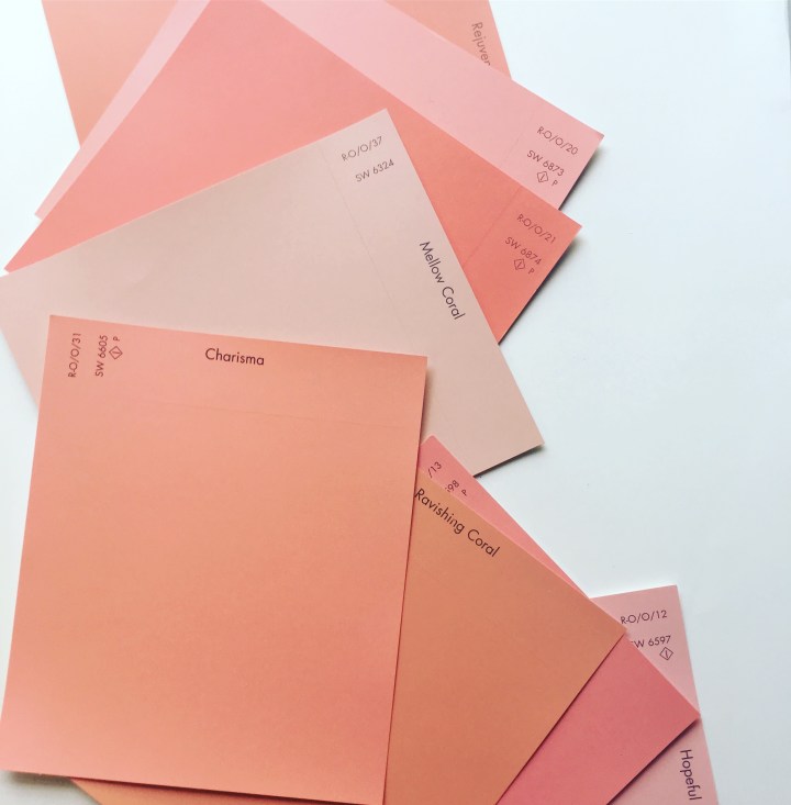
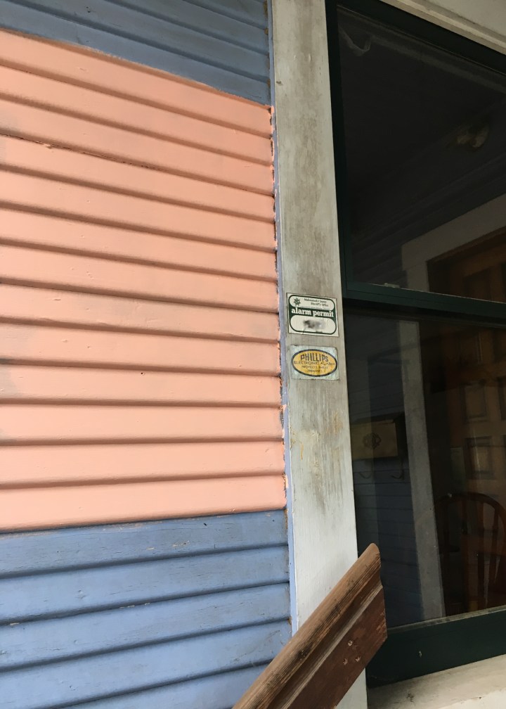
Bold colors tend to look even brighter on larger surfaces, so it’s important to select ones that go much more grey than you’d originally think. I ended up landing on Sherwin Williams 6611 Jovial. I picked up a color test pot at Lowe’s and popped some swatches on the house. Instantly it was bright, happy, and colorful!
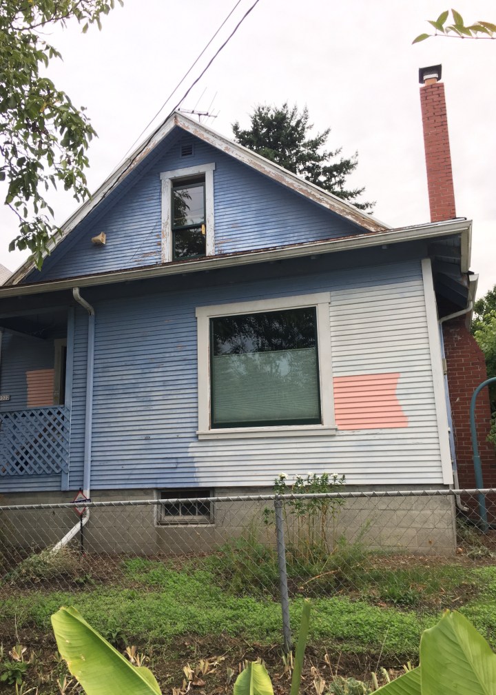
It looked good by the door, bright and happy. It’s always shady here and since this is the main way you get into the house, it’s an important view. Of course, it would look even better if the trim wasn’t filthy dirty!
Still, I wasn’t sure. What if it was just a tad too bright? I brought in a back up swatch: Young House Love’s Sherwin Williams 6324 Mellow Coral. You can see below it’s just a little duller and a little more grey/brown in tone.
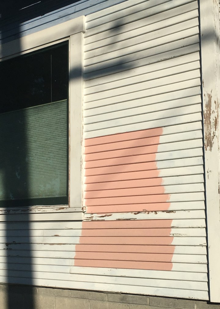
So although I had a color selected, I did not have the exact color finalized. I’m still debating endlessly. Mellow Coral is safer, it will clearly look bold on the home. Young House Love’s beach house is happy and absolutely colorful. Jovial is happy, just subtly different from Mellow Coral, and just a tad brighter. But is it too bright? What do you think? Which do you prefer? Which would you choose?
Luckily, although I’m stumped on the color for the siding, the color selection for the trim is easy: SW 7012 Creamy. It’s a happy white with a warmer undertone which will brighten nicely against Portland’s often cool grey skies.
And the roof? Also a quick decision! I’m going with a 40 year roof by Owens Corning in the Sierra Grey colorway.
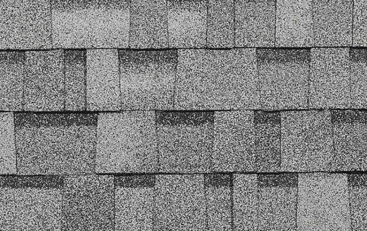
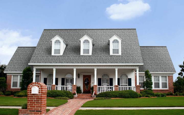
This is a nice light grey shingle with plenty of color variation. As Berrybrier has no air conditioning (and as someone who’s never lived in a house with air conditioning I have no plans to add it) I wanted something lighter that would reflect more heat in the summer. Dark colors absorb heat. It’s a basic scientific fact that almost everyone knows. So although dark roofs look fantastic and are extremely popular, I knew it wouldn’t be for me. Something light, bright, with significantly less heat retention would be most important. This picture also from Owen’s Corning shows a look similar to what I’m hoping for with the Sierra Grey. It’s light, but it’s not white and it has plenty of color variation. Decision made!
Now if only I could be one hundred percent sure about the siding color! Help! What would you pick? Random strangers walking by my house are being accosted for their opinions on paint color and I need yours too!
Brighter or more subdued?

I say go for the one that’s a bit more subdued – still looks like coral and is bright enough to pop under any light conditions.
Lisa, that’s where I’m leaning too. My heart just wants the brighter one!
Heck! If you’re going to go bold – go all the way and do the brighter, happier shade!
Just my 2 cents!
Smitty
I also like to top colour. Cooler and crisper and hipper 😀